
A good site layout and graphic design should be cohesive. Making a great header, selecting the right blocking ratios, pulling a solid set of reusable splash images… Every line of CSS might be great on its own, but if they don’t fit together, you get hot dog jello.
Each individual component might be great on its own, but as a unit, they can be frustratingly at odds with each other.
That said, I’ve got limited work time. Right now, I have about 30 minutes, so let’s whip up a solid header that I can live with while the rest of the project moves along.
Starting Point
The base underscores template is really basic. Check out where we started in August 2025.

I’ve already done a little navigation bar work, mostly because the default is to smash all of the nav items together as a horizontal ul. In my case, it looked like HomeAboutWriting SamplesStatement on AI when I first started.
The base template generates DOM elements for the site title (Matt Frye), the tagline (Converting Coffee…), and a horizontal navbar.
Goal
I like simplicity for my own work. When I say “simplicity,” I don’t just mean minimalist, basic, or pedestrian. I mean “few components” or “no unnecessary complexity.” I don’t like ever-expanding menus (I’m talking to you, Salesforce). I don’t like DOM elements that move and resize as you are interacting with them. I really don’t like using Javascript to create and load front-end elements after the page loads.
Each of those designs are fun to watch and they can be engaging in media with low latency. For instance, I love the constantly unfolding menu in old Sid Meier’s games, but I hate when browser-based knockoffs try to replicate the same thing inside a container that isn’t optimized for that functionality. It’s a bad user experience, especially if I’m trying to drive my mouse toward a goal and a little bit of lag reads a mouseout and collapses everything.
So let’s go with something simple. Site title aligned left. Menu on the right. Let’s put that tagline in the space below the title and menu, but slide it out of view when the page scrolls down. (It’s a joke I came up with years ago working at an engineering company, and I like the honesty of it. If you’re wondering, the remaining 30% is lost to heat and noise.)
End Result
How does this look?
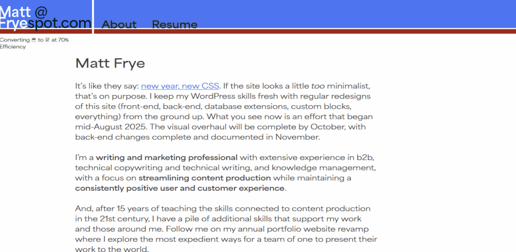
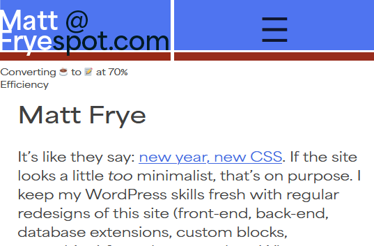
It could be better. That tagline is still awkwardly placed. I might drop it later on. I took this domain name back in 2010 when this site was a replacement for the Blackboard learning management system (#iykyk), and I’ve always struggled with a decent logo. I’m liking this new route of highlighting both my professional email address, my name, and the site name in one block that isn’t easily readable by bots.
Maybe most importantly, it is a simple, clean design. I have room for more menu items (one or two, if the titles are short), but I don’t know that I’ll them anytime soon.
Bonus!
Along the way, I did update some font definitions. I don’t like forcing a font download, but I really like the look of the Area font set, so you’re stuck with that additional resource while you browse here. If you block it, then we’re down to your default sans-serif and things aren’t going to look great.
