I am a content writer at METER Group in Pullman, Washington. From 2008 to 2021, I taught college writing, multimedia design, and communication strategy classes -- now, I spend my time doing the things I taught others to do!
Maybe that title is hyperbolic in July 2026, but let’s give it time. In 2027 this bubble might have popped, or we (the US economy) might have so fully hitched our wagon to this software that the boll weevil looks like a mild risk in comparison.
Either way, my kids’ futures done been ‘et, and my present could be an appetizer.
See, I do a lot of email marketing. I spent a few years on just the writing and content planning side, and since 2024, I’ve also done everything short of server record management. From email template creation and maintenance in Pardot to planning out multi-touch sequences to nurture interest, I’m the one-stop-shop for email on our small team.
That’s why Google’s Gemini inbox, Microsoft’s inclusion of Copilot everywhere, and everyone else’s sudden embrace of agentic tools to manage their incoming email is really bugging me as both a marketing professional and a communication specialist.
Professional Issue: No Rulebook, No Playbook, Just a Matchbook
Everyone in tech likes to call their product disruptive. But if a tool or technology changes some fundamental truths, that’s more than disruption.
Adaptive spam filters and reputation scores were disruptive. They forced some good changes that were entirely in line with effective communication practices:
Clear subject lines that had a content connection to the email body
Email bodies that were long enough to contain actual information
Links with human-readable targets
Consistently sending messages people want to read
Disruptive changes might change some parts of the rulebook, like GDPR enforcing higher standards of privacy protection and respecting communication preferences, but the rulebook still exists. Communication playbooks might have to update their approach to individual tactics, but the strategy is still recognizable.
An autonomous, opaque software layer in the middle of a communication technology is not disruptive. It does not force good or useful adaptations. Two years after the earliest consumer tools were rolled out by Apple, email marketers are still trying to figure out what the tools are doing to marketing emails, if only to avoid an agent rewriting a promise to something that can’t be kept.
Communication Habitus Issue: no-reply@babeltower.org
Long before I worked in marketing, I taught technical and professional communication. In the early days of my career, educational CMSs were dodgy enough that I needed to create my own. To handle communication, I set up mail servers and email automations.
This was 2010. Hardly the early days of the internet, but still a very different world than today on the technical side.
Email protocols haven’t changed much since their creation in the 80s. Everything is additive and backward compatible. I can tell my AI assistant to use Gmail to send a message to a lab manager at Cal Tech who has had the same email address and CLI client for 40 years. That’s pretty impressive considering the fact that Android and Apple can’t agree on how to handle SMS.
But inserting a software layer in the middle that sorts, filters, prefetches, summarizes, and (in some cases) clicks emails breaks the assumptions we’ve always had about this channel of communication. It’s like asking my teenager to not just check if our mailbox has any envelopes, but also asking her to throw out anything she thinks is not worth my time, to open and read things that I might be interested in, and to preemptively respond to things before she carries anything into the house.
As a communicator, I can’t just rely on the norms of interpersonal communication to get my message to the recipient. There is now a wall between us that can’t be audited, error checked, or directly configured. Early versions had to be activated or run manually, but current tools are part of the inbox’s basic functionality.
Email is just one channel for communication, but schools, government orgs, businesses, and community groups use it as the official channel for information. As we are able to rely less and less on this channel faithfully delivering our text to our audience–or delivering their message to us unchanged–where do we turn next?
A few days ago, a childhood friend texted me out of the blue to tell me about a pork tenderloin sandwich.
Now, if you haven’t spent much time in Indiana, you’d probably think that was weird, but Indiana pork tenderloin sandwiches are a thing of legends. The secret is taking an entire 9 pound tenderloin, pounding it flat until it wouldn’t fit into the trunk of your car without folding it first, then deep frying it in what I imagine is a hot tub-sized fryer.
You serve it on one of those tiny hamburger buns with a tomato and some lettuce, just to pretend that this is a sandwich and not an endurance challenge.
Then we started talking about what’s been going on the last few years. He’s in quality management at a manufacturing company now. I joked that as a former tech writing teacher, I’m also sort of the QA/QC guy of marketing teams I work on, especially when we’re all seeing so much work farmed out to AI agents.
He said something that stuck with me, the kind of little aphorism that keeps ringing every time it’s relevant. Compliance guy is important guy.
QA, Compliance, Writing
I’ve posted about some of my process documentation and onboarding strategies before. A lot of that comes from teaching and assignment design strategies. Generally, an assignment is split into two cognitive loads: the thing you want to assess and the other stuff.
For instance, my tech writing classes would often do a post-mortem or redesign of documents that existed on campus. I was assessing their understanding of document design, rhetorical strategies, and written language. I was not assessing their ability to find documents or submit the assignment using whatever tool the university had subscribed to that year. The project instructions were very detailed on the processes I wasn’t grading, so the cognitive load of the assignment would be focused entirely on what I was grading.
QA in document and marketing communication management is similar. Teams have a lot of members with different specialties. The cognitive load of getting work done is spread across the group. But, since everyone has their own list of separate things to work on, it isn’t always possible to have every specialist touch a project.
That’s too abstract. What do I mean?
A good example is the <br> tag in html—or the various <h*> tags, <blockquote>, and <b> vs. <strong>. If you aren’t a web person, these might just be different ways of making text look the way you want. <br> adds empty space above or below something. <h1> is large and bold, while <h7> is regular-size and sort-of-bold. <blockquote> will indent your text.
Or, at least, those are the rules on most browsers. Those tags all mean something, and the visualization is just a holdover from the ancient days of html, before we relied on css.
Why does it matter?
Well, if you’re not a web person and you just want text to look a certain way, you might end up writing a heading that looks like
<strong><bold><h1><small><small><blockquote>Learn more about this product</blockquote></small></small></h1></bold></strong>
Learn more about this product
That might get you a look that you want, but it’s extremely difficult to maintain, especially when one person formats their headings that way, while another uses <p style="font-weight: 500; font-size: unset; margin-left: 3rem;"> and another uses <h2 class="pre-cta-heading">. They might all look the same (or nearly the same), but doing a site-wide audit involving those headings or styles becomes a nightmare very quickly.
Why does this matter?
I’m always thinking about the big picture over the long term. That’s a teacher thing. You think of your assignment sheets as part of a course-long sequence, which might be anywhere from eight to sixteen weeks. You create a full content strategy to cover every course you teach, whether you’re doing five technical writing courses a term or a mix of subjects. You plan every contact point as part of some larger narrative that students will experience over a defined amount of time.
And, you audit your work. When you realize some language is unclear or some processes are missing steps, you revise content. When your institution changes the tools it uses for content management and grading, you revise content.
But revision isn’t just opening up each document, making changes, and hitting “save.” At OIT, I taught a dozen different courses, several of them on both 8- and 10-week timeframes, and all of them had to plan around holidays and major events in the fall, winter, spring, and summer. So, a dozen courses with four variants each. Each had three to five major projects. Back of the envelope, we’re talking about {12 x 4 x [3, 4, 5]} project sheets to revise whenever one of those major changes were necessary, so ensuring conformance to some technical and design standard was very important.
The same is true outside of academia. I manage the pages for 70 or so products, and a few hundred knowledgebase resources. A common element on all of those pages recently quit working and needed to be changed on every single one. (Yes, this is an ideal place for a shortcode or reusable block or something else, but that decision is above my paygrade.) Thanks to some QC efforts over the last year, we could just do a global find/replace across the website database and change all of the affected elements but not similar elements on other pages. A task that would have taken weeks to do manually took less than ten minutes thanks to a little extra effort and regular audits.
There’s still a mountain of other stuff to standardize from before my time here, but at least now we’ve got a business case for explaining why it’s worth insisting that folks pay attention to minor details like html tag structure.
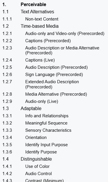
The W3 Consortium maintains a list Web Content Accessibility Guidelines. Similar to the web and print communication requirements of the US Rehabilitation Act section 508, these these are broad goals for any piece of outbound or inbound communication.
But, if your content isn’t directed at folks with known disabilities, are these guidelines actually important? Yes, and for more reasons than you might think.
Not meeting accessibility guidelines locks large segments of your potential audience out of your content
Meeting accessibility guidelines allows members of your target audience to use your content in more ways that meet their needs at the moment
Ignoring accessibility guidelines can mean fines or a suspension of business in some countries
What are these guidelines?
At first glance, the WCAG 2.2 guidelines can be overwhelming. There are about 100 separate items, ranked as an A, AA, or AAA standard. There are no clear-cut rules, like “use this size of text.” Instead,
The Section 508 website builds from this list of standards and tries to demystify them with concrete recommendations for US federal organizations or groups that do significant business with or as a conduit for federal organizations.
The European Accessibility Act (EAA) also leans on WCAG guidelines, but it reaches further than US Section 508, impacting any business or organization that purposefully communicates with audiences in the EU.
When it comes to actually following them, each standard is a discrete element that can be met or not met. The WC3 has also provided as much guidance as possible to simplify accessible designs without constraining the designs that can be implemented. Structurally, the top level of each criterion written with the assumption that a reader knows enough web design and communication theory to evaluate their own work. From there, linked pages offer more detailed advice, examples, and occasional tools to assess a document’s accessibility.
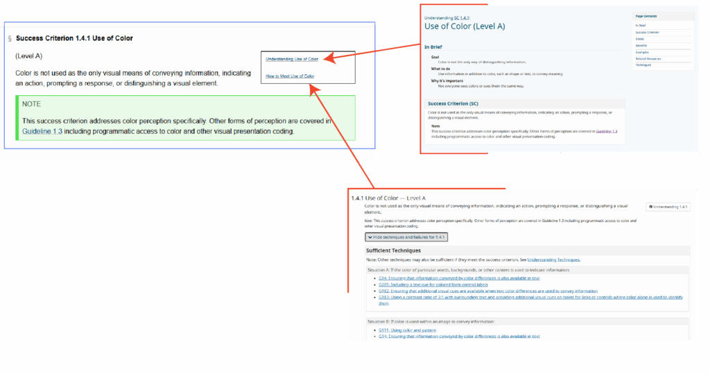
Each standard is described as a success criterion, a simple is or is not statement that ought to describe a webpage, document, video, podcast, email, or other piece of web-based content. They include notes and subpages to help clarify the intent and goal of the criterion.
Success Criterion definition
The definition is meant to be easy to unpack. On use of color, we are told that color is not the only way that a page conveys some type of information. For example, if a webform indicates that some input is wrong (maybe an email address is incomplete or passwords don’t match), we typically highlight the form element in red, but we also need to add some other visual indicator like a ⚠ warning icon or a line of text alerting the user.
Importantly, the criteria are ranked by level. Level A criteria are bare minimum expectations for all content to meet (where applicable). Level AA are the standard expected by the European Accessibility Act, and many users would consider them the norm of web content design. Level AA standards are noticed when they are absent. Level AAA are the highest grade of accessibility. Meeting Level AAA standards may be beyond the technical capability of some content, and it may undermine the creative goals of other content.
Understanding the criterion
An definition page includes a thorough walkthrough, examples, notes on the intent of the criterion, and more. Critically, many criteria include test rules and free tools to evaluate different aspects of web content.
Using the criterion
The implementation page includes technical guides so designers without deep experience in multiple web languages can meet these success criteria. For instance, the Use of Color criterion points users to HTML and CSS code snippets to change webpage component appearance when they receive the “focus” attribute—like when a user with assistive technology scrolls through a page, when a user presses the tab key to move through elements on a page, or when they tap their screen
Do I need to meet them?
While WCAG sees these as guidelines, other governing bodies do see them as rules. The EAA fine structure applies to any organization doing business in an EU member state, and the EAA expects a meeting minimum of Level AA criteria at every possible instance.
Maybe more importantly, these guidelines are just plain good to follow. They make communication easier to consume and understand. They cut out the friction users might experience on a website or when enjoying a video or podcast. As web technical standards continue to evolve, the expectation will always be that people are trying to follow these guidelines—if you’re already trying to meet the guidelines, then the technical standards won’t be something you need to fight against.
How do I know if I’m meeting them?
Unfortunately, there aren’t many easy, one-click solutions. Paid services exist that will audit your website’s CSS and HTML files along with video and audio assets. To some degree, these standards are designed to make it easier for software to consume media, particularly in the case of assistive technologies like screen readers. But, in the end, these guidelines are written with a focus on making your content human consumable.
The best way to know if you’re meeting the guidelines is to stop asking whether you’re trying and start looking at (or listening to) your content from different viewpoints.
What’s a disability?
We often talk about accessibility as an extension of disabilities, but it is a bigger concept than simply meeting the needs of users with different ability levels. That said, it’s important to consider the core group of users that accessibility guidelines are designed to help.
The Typical Definition
Usually, we think of a disability as a missing or impaired ability common to most people. This is very limiting, and it hinders our ability to make good design decisions for al audiences.
For instance, On the web, vision impairment is a common concern. We may be talking about fully or functionally blind individuals accessing the web, or we might be talking about individuals with color blindness or extreme near-sightedness. Similarly, auditory or cognitive impairments cover wide spectra, any part of which can complicate consuming content. None of these specific instances cover some of the most common issues affecting web users.
The Real-World Definition
For many users, accessible designs mean they can get their phone to read emails out loud while they cook breakfast. Accessible designs mean a website will be clear and legible even on a monitor with poor contrast or color definition, or even with the brightness turned all the way down for night reading. Accessible video content has accurate subtitles and a complete, time-tagged transcript, so users can CTRL+F and find a specific piece of information as easily as they could in a text document.
In this sense, a “disability” (when considering our audience for web content) is actually any physical state, environmental context, or technological configuration that could impede someone’s ability to read, listen to, view, or interact with the content we create.
A noisy environment makes it difficult to hear a video, so the user turns on subtitles
A busy parent uses a screen reader to listen to emails and team chat channels before work while kids are getting ready
A customer is browsing several ecommerce sites at once, and they rely on well-thought out layouts and use of semantic tagging to easily compare features and prices
How do I prioritize these guidelines?
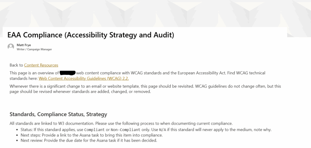
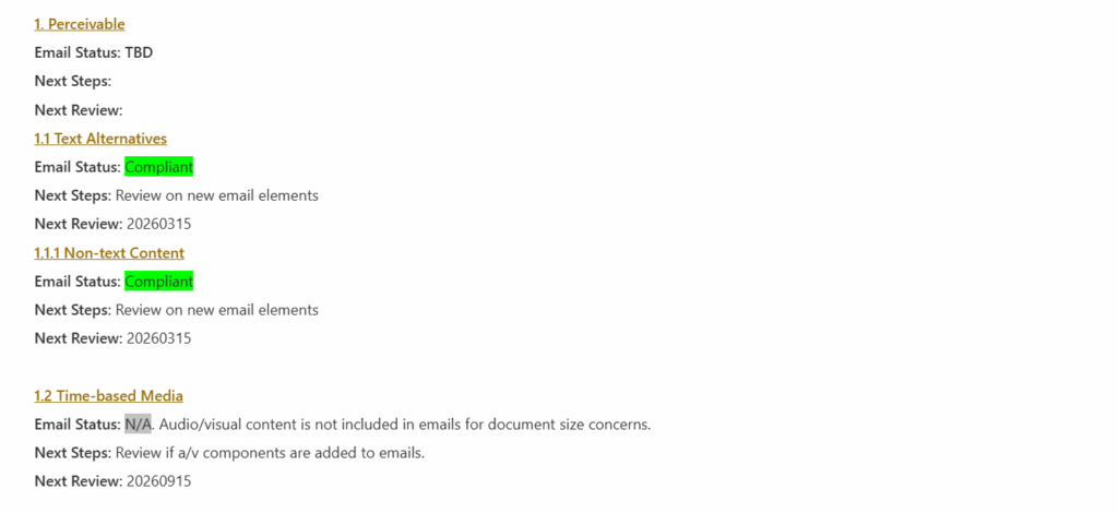
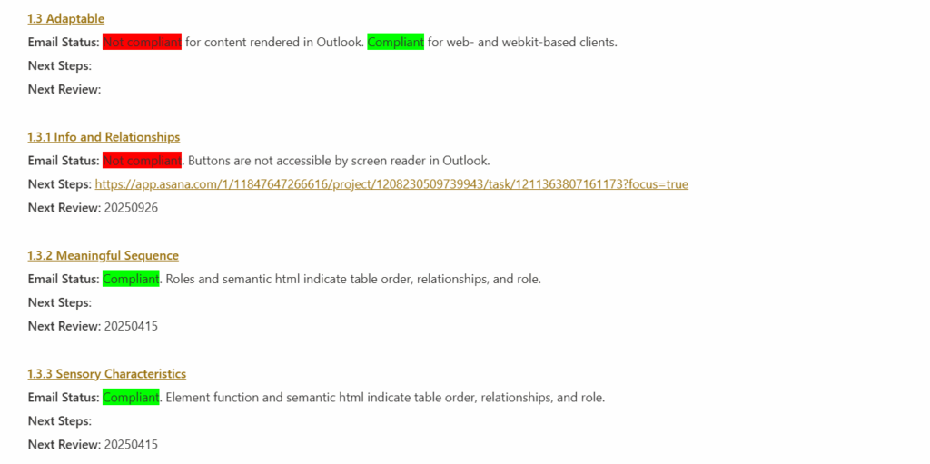
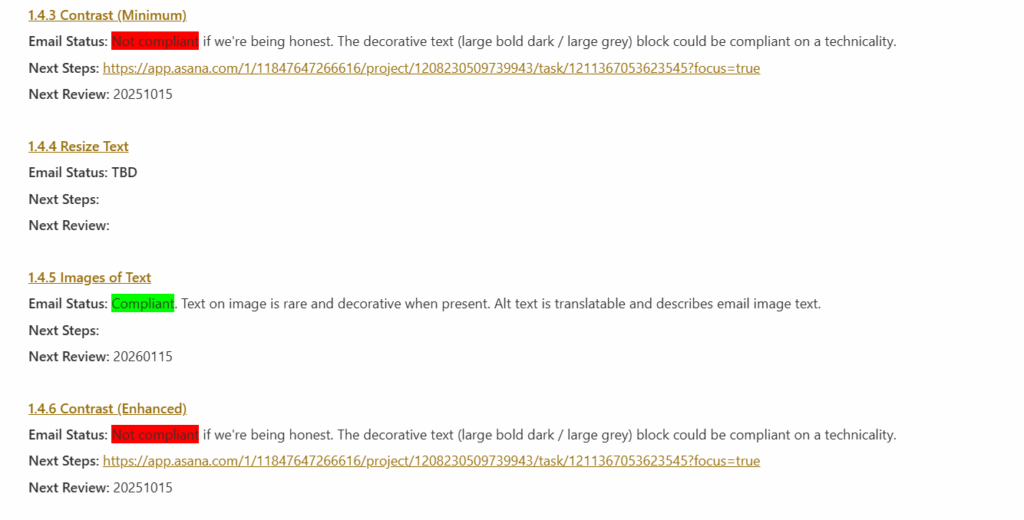
With 100 guidelines to follow, prioritization is key to managing an accessible design. When auditing the design of any media, a simple method of triage can help you reach your goal effectively. The example below shows the results of an audit I performed on a company’s email templates.
Successes
First, work through the list and document every criterion where you are already succeeding or that do not apply. If you’re already following common practices in your content, you likely meet many Level A and AA criteria. More importantly, these guidelines cover all web media, including video and podcast content. If your own content doesn’t include those technologies, you don’t need to worry about them.
Documenting successes will help thin the list to the things you need to address rather than providing and endless supply of things you can always improve on.
Sidelines
Next, honestly document the things that you are not in compliance with and that you don’t intend to be compliant with. Many Level AAA guidelines are difficult to achieve, and they can require significant changes to how you are planning your content in order to release them.
For instance, this page uses several screenshots of English text. If your computer’s or browser’s default language is not English, you might be reading a translated version of it, but your translator cannot read the content of those screenshots. I’d love to make this page more accessible to translators and screen readers, but the best I can do right now is the Level AA standard of providing detailed alternative text. I cannot meet the Level AAA standard of removing text from images entirely.
In some cases, you may be locked into non-compliance due to the technical limitations of your composing tools. Documenting this gives you an easy place to pick up should those technologies ever offer more accessibility features.
Struggles
Finally, the real work begins: document the places where you are out of compliance and where you can improve. After the first two sweeps for Successes and Sidelines, the remaining list is unlikely to be onerous, but each item is something that will need to be addressed individually.
What next?
If you want help with an accessibility audit or need some advice on meeting specific success criteria, let me know. I have a depth of experience finding and creating accessible solutions for web and print, particularly when the communication technology itself seems to impede every effort at improvement.
A good site layout and graphic design should be cohesive. Making a great header, selecting the right blocking ratios, pulling a solid set of reusable splash images… Every line of CSS might be great on its own, but if they don’t fit together, you get hot dog jello.
Each individual component might be great on its own, but as a unit, they can be frustratingly at odds with each other.
That said, I’ve got limited work time. Right now, I have about 30 minutes, so let’s whip up a solid header that I can live with while the rest of the project moves along.
Starting Point
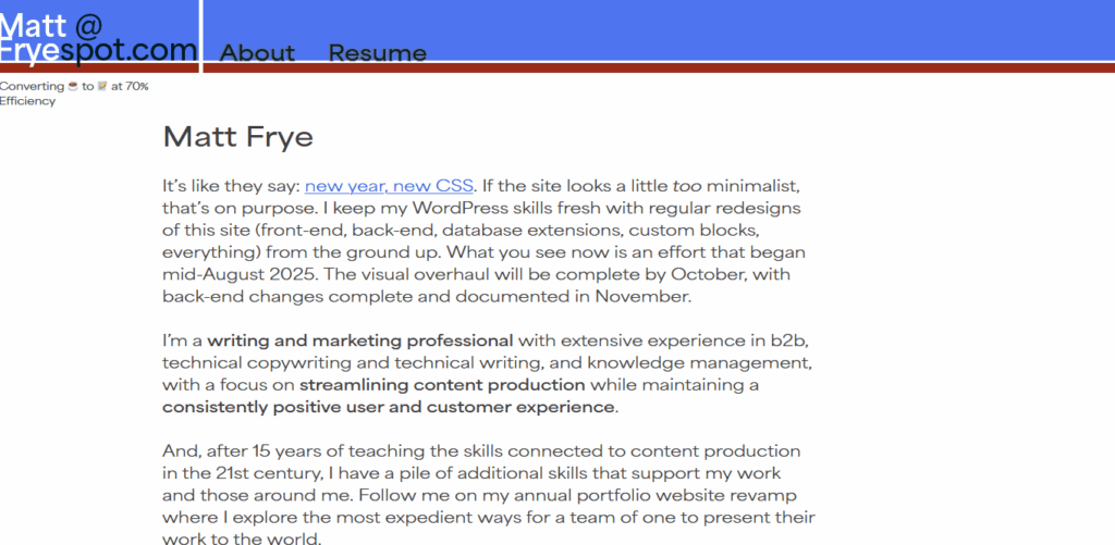
The base underscores template is really basic. Check out where we started in August 2025.
I’ve already done a little navigation bar work, mostly because the default is to smash all of the nav items together as a horizontal ul. In my case, it looked like HomeAboutWriting SamplesStatement on AI when I first started.
The base template generates DOM elements for the site title (Matt Frye), the tagline (Converting Coffee…), and a horizontal navbar.
Goal
I like simplicity for my own work. When I say “simplicity,” I don’t just mean minimalist, basic, or pedestrian. I mean “few components” or “no unnecessary complexity.” I don’t like ever-expanding menus (I’m talking to you, Salesforce). I don’t like DOM elements that move and resize as you are interacting with them. I really don’t like using Javascript to create and load front-end elements after the page loads.
Each of those designs are fun to watch and they can be engaging in media with low latency. For instance, I love the constantly unfolding menu in old Sid Meier’s games, but I hate when browser-based knockoffs try to replicate the same thing inside a container that isn’t optimized for that functionality. It’s a bad user experience, especially if I’m trying to drive my mouse toward a goal and a little bit of lag reads a mouseout and collapses everything.
So let’s go with something simple. Site title aligned left. Menu on the right. Let’s put that tagline in the space below the title and menu, but slide it out of view when the page scrolls down. (It’s a joke I came up with years ago working at an engineering company, and I like the honesty of it. If you’re wondering, the remaining 30% is lost to heat and noise.)
End Result
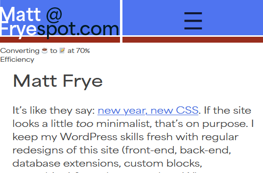
How does this look?
It could be better. That tagline is still awkwardly placed. I might drop it later on. I took this domain name back in 2010 when this site was a replacement for the Blackboard learning management system (#iykyk), and I’ve always struggled with a decent logo. I’m liking this new route of highlighting both my professional email address, my name, and the site name in one block that isn’t easily readable by bots.
Maybe most importantly, it is a simple, clean design. I have room for more menu items (one or two, if the titles are short), but I don’t know that I’ll them anytime soon.
Bonus!
Along the way, I did update some font definitions. I don’t like forcing a font download, but I really like the look of the Area font set, so you’re stuck with that additional resource while you browse here. If you block it, then we’re down to your default sans-serif and things aren’t going to look great.
I’ve spent a lot of years working in WordPress. I used it to build some early learning management systems (LMS, a specific type of CMS designed for classroom use) long before COVID made remote learning such a hot topic. I’ve used it to build hobby websites for table-top roleplaying games. I’ve used it to build simple web utilities for the family.
So, every year or so, I like to drop the active theme on my website and rebuild from as close to zero as possible. I use the underscores base theme created by the same folks behind many other WordPress utilities. It has the core pieces I need to determine layout, add some custom blocks, and keep up to date on the backend.
For the past year or two, I’ve felt too busy to keep up and I fell back on an old theme that had been gathering dust in my hard drive. As a result, the site itself gathered quite a bit of dust while I worked on other projects.
2025-2026 Goals
Between now and the autumn 2026, I’m shaking off the dust. Let’s make this blank slate something interesting to look at!
Design
First off, I need to hone some existing skills.
Build some custom blocks for portfolio pieces.
Build some automations to support a portfolio workflow.
Play around with grids and shaped divs.
Make the color scheme work for all visual abilities.
Then, let’s see if I can practice a few things that have changed or developed quite a bit since I last used them.
Complex responsiveness that listens to more than just screen width.
Real-time database interaction with jquery.
WooCommerce and ad integration.
Six goals, twelve months. Seems doable?
Content
Rather than test the design developments on some bland ipsum text, this website really needs to go back to holding some interesting content (even if it’s only interesting to me).
More portfolio pieces along each of my content management and campaign management skillsets—email campaigns, CRM work, data analysis, and more.
Some personal blogging. I’m tired of giving this content to social media companies for free!
Some professional blogging. I am living the lessons I taught as a professor, and maybe I ought to start documenting that stuff more publicly in case I return to the classroom someday.
Progress Tracking
In campaign and project management, I like to ensure that every goal, task, and outcome is explicitly defined and documented, so keep track of the New year, new css , Web design, and Content development in action tags to see how things are moving along.
In a big, big survey, researchers found that the total time savings we’re getting from jamming AI into every workflow we can find is less than 5% (or, for a typical workday, less than 25 minutes of saved time).
It’s possible that we are doing more productive work as a result of these tools, but very few people are getting bigger paychecks as a result.
Now, I’m a writer, but it’s been a long, long time since I sat with a pen in my hand to draft anything meaningful. I analyze marketing strategy stats, so I spend a lot of my workweek in Excel. I do a lot of web-based work but I grew up in the era of shareware, so I prefer to code and compile the tools I need rather than buy yet another plugin, add-on, or app to do a simple task for me.
In other words, I live in software. And, I love a good time-saving tool or hack, I really do. That said, Tangermann is spot on: my workflows have become flooded with unblockable, unstoppable “tools” that inject AI where it isn’t needed. The result? I spend unnecessary clicks, time, and mental energy trying to get my work done with what amounts to an overeager toddler at my side, making me long for the days when I could just turn Clippy off with two clicks.
Not a Luddite: AI Has a Place
I have a Statement on AI that lays out my professional boundaries for artificial intelligence, machine learning, and other algorithm-based tools. I’ll restate here that I really do like AI as a method for performing certain tasks, but I don’t think it fits every task.
My feelings about AI are a lot like my feelings about my Instant Pot. It can do so, so much stuff, and it can do a lot of that stuff well. It can’t do everything, though. In fact, there are many things I see people using Instant Pots for that are wildly inappropriatebecause we already have a better tool for the same task.
What is AI good for? Pattern recognition. I loved using BERT to analyze large corpora of text samples. It saved me a mountain of time working through student feedback when I was a professor, and it helped me understand where I spent most of my time commenting on student work.
What is AI not good for? Pattern creation. Generative AI can regurgitate a decent facsimile of existing material, but it can’t really create anything new or meaningful. That’s why chatbots have the potential to be useful (so long as they are given very low volatility values and a tightly curated training set). That’s why AI image generators can create vapid, space-filling stock photos pretty well. It’s why the “generative fill” tools in audio/visual software is pretty good at removing graffiti from brick walls.
In other words, AI can be useful in the right context, and it’s the most useful when someone chooses to turn that tool on. AI, like my Instant Pot, has the capacity to really ruin the day when it turns on without my knowledge or consent.
Lost Time
But how much friction are we talking about during the day?
Well, I launched Microsoft365.com today to hop into some Sharepoint content creation to support my team, to fire up Teams, and to launch a few company apps. Before I could get to any of those things, I had to get past the Copilot screen.
Notice that the three suggested tasks (Analyze this text and make suggestions… Write some funny OOO email replies… Rewrite this to sound more professional…) are not the things I need to do. Yet, the chatbot takes up 80% of the visual workspace, more if you count the Chat and Create menus in the left sidebar. Now, I get to wait for this bloated tool to load before I click Apps, a screen that comes with its own load time.
It’s the same in Asana: loading the page brings up a happy helper offering to summarize my day for me, but I’m a professional and I already know what I need to do. Teams wants to suggest new people and projects for me to check out. Outlook really wants to offer me an AI summary of an email full of technical details that I absolutely need to read as they were written by an engineer.
At every step, I have to tell the software “no,” I really do not want this additional function to run, or I want to you ignore the output of the function you’ve already run. I do not want assistance in doing the task that I am paid to do, that I know how to do, and that I opened a page or program to do.
Even worse, more than once every day I change tabs to work on another task rather than wait for the AI tool to finish loading its happy helper message, only to realize later in the day that Item 1 on my to-do list is still unchecked and I no longer have the brainpower to tackle the biggest problem of the day.
Old Man Rants at Clouds
These tools are here to stay, and I can be as angry with them as I was when every operating system decided rounded window edges were the new thing. But, if we are just focused on saving time or being more productive with these tools, maybe we ought to really ask if the tools are doing those things or if that’s just what the product packaging promises.
In 2025, it seems like we all need to clearly state our stance on the role of AI in any creative, analytical, or administrative work. My direct statement is that I don’t endorse the use of AI tools to replace the expertise of readily-available humans.
But, there are some qualifications in that statement, so let’s unpack them.
AI tools or Chat GPT?
First off, what are AI tools and how are they different from Chat GPT, Copilot, Bard, and similar “general purpose” AI tools.
Machine learning and artificial intelligence are legitimate tools that can perform narrowly-defined tasks with pretty good accuracy, especially if they are carefully trained for the task they are applied to. In image processing, facial recognition algorithms are good enough to accurately apply silly masks and filters on video chat apps. In data processing, algorithms can perform multiple regressions and ANOVAs on huge data sets, find patterns, and find best-fit curves. In text generation, … well, auto-correct and text suggestions can accurately predict what word or phrase I want to use about 25% of the ducking time.
An AI- or ML-based tool is exactly that: a tool. And, just like a hammer is a tool that excels at the task it was designed for and fails miserably at other task types, general-purpose and generative AIs have a tendency to fail spectacularly when they are asked to do something other than very general content generation.
What about prompt engineering?
I’ve worked with some people who are great at developing complex prompts that cause an AI tool to deliver the type of content they need for a task.
That is a human expertise. That expertise has value.
I can prompt stable diffusion to generate images that serve my non-commercial, non-professional needs. I can prompt Chat GPT to create something more usable than lorem ipsum. But, I do not have that degree of prompt engineering expertise for the same reason that I can’t design a web app in C#—I have chosen to develop different expertises.
Why is expertise important?
In paid and organic marketing, AI companies and consultants present the tool as a replacement for some human expertise. Often, it’s in other language, like
Use AI to write your website [implied: instead of hiring writers, a developer, a graphic designer, etc.]
Use AI to write your emails [implied: instead of spending that time yourself]
Use AI to plan your next event [implied: instead of working with a planner]
Use AI to invest in crypto [implied: instead of watching my other YouTube videos about doing it yourself]
At every turn, AI is used to reduce time spent on other tasks. But, let’s unpack that sales pitch: whose time?
When I see other professionals using Chat GPT to write their emails (especially cold-call sales emails), they are reducing the time spent applying their sales and communication expertise to solve a problem.
When I see other professionals using Copilot to write SEO content titles, they are reducing the time spent applying their SEO writing expertise to solve a problem.
When developers and software engineers show me products made entirely with AI, they have reduced the time spent applying their programming expertise to solve a problem.
That’s bad under two conditions: first, if you believe that human creativity and expertise is always better than what machines can produce; second, if you have farmed out a task that the AI was not designed for.
Am I a Luddite? Is human creativity always better?
No, I don’t believe human creativity is always better. Copilot recently suggested a better sql database design than I would have come up with in my first two or three rounds of planning. Granted, my skill at sql is limited to building and maintaining WordPress plugins, so it could adequately replace my expertise.
And that’s the ideal use-case. The worst case scenario of AI getting that question wrong was that I would have an inefficient but functional database design. That’s the specific problem I was trying to avoid by asking Copilot, but it’s also the minimum outcome I could produce on my own.
Wrong function, go to 10
If I had zero sql skill and I asked Copilot to give me an answer I couldn’t evaluate, I might end up with broken code or a template design that I couldn’t adapt to my own needs.
This is where AI fails in content generation. As a writer and multimedia content creator, I think about every part of the user experience in the material I create. I consider the subject lines of emails: at what point will the text be truncated or cut off on different email platforms? Am I OK with mobile users getting text cut off at a different point than browser users? I also consider how the text of social media posts will land horizontally in the post frame, whether that might create a distracting pattern.
Basically, I think about a variety of user experiences to everything I create. Absent very specific prompting patterns (including prompting for multiple outputs which must then be evaluated by someone else), AI tools are not designed to or capable of doing the same. Some claim to be capable of that for a steep fee, but if your team lacks the expertise to evaluate what the AI produces, is the cost worth it?
Why emphasize human expertise?
Ultimately, I emphasize the importance of human expertise for one very specific reason: you can ask a human to explain their reasoning and process behind something they produce. By extension, you can ask a human to train you or someone else in creating and evaluating that same type of work. You can investigate that human’s credentials to make sure they have the expertise necessary to do those things.
AI and ML algorithms are built from mountains of data. Even if we want to make the argument that education and experience are just a mountain of data, a human’s data has typically been evaluated by yet another expert. The most popular AI tool out there, Chat GPT, uses a mountain of data that unevaluated at best and poorly constructed at worst.
Humans are accountable, humans are culpable. Humans can be questioned. Humans respond to input. Truly well-imagined, narrowly-designed AI can do some of these things, but the effort necessary to create, vet, market, and learn those tools is typically greater than just finding a human capable of the same task.
tl;dr: Boxed Cake Mixes
Ever since Chat GPT was released to the public and stable diffusion became available for download, I have thought of AI tools like boxed cake mix. Feed it the right ingredients, wait a little bit, and you get the output it claims you get. Feed it slightly different ingredients (more eggs, a different milk, different pan shape), get a slightly different output.
Brioche bread has very similar ingredients to cake, just differing in amounts. Getting boxed cake mix to produce bread is exceedingly difficult, but it’s possible if you fully understand what’s in the mix and what’s necessary to force it to behave like bread dough. If you don’t have enough flour to make bread dough but you’ve got a box of white cake mix, then it can sort of work in a pinch.
So, I don’t endorse the use of AI tools to replace the expertise of readily-available humans. I don’t endorse it to do anything other than the narrow task that it was designed to do, whether that’s finding patterns in data or imagining common sentence constructions. If no humans are available, then AI can fill the gap temporarily, but we need to be honest about what expertise we are giving up when we start typing out prompts.
I’m working for a company that recently split into a few separate bodies. As part of the split, each group took a copy of duplicable marketing materials. The set I’m working with most right now are email and landing page templates from our customer relationship management (CRM) software.
And. wow.
I was told initially that the company split because it was getting to be too complex, and that definitely feels true looking at these materials. The food science side and the environmental science side, for instance, produced very different materials for very different audiences. But, the split was also recent enough that I’m combing through old materials to find models for what I’m supposed to produce. Writing my first few emails and creating my first landing page here took a lot longer than it should have because I didn’t have a solid starting point aside from a plethora of examples.
Examples vs. Templates. Copy/Paste vs. Fill-in-the-Blank.
As a copywriter in other settings, I’ve gotten into intense discussions about the value of templates. Essentially, the debate comes down to an issue of creative freedom. Some see templates as an unnecessary constraint, a “paint by numbers” sort of approach to creating material that removes a lot of the content creator’s skill from the equation. Others (like me) see templates as an enormous boost to creativity: by making some hard limits or expectations explicit, a template shows where the most creative potential is in a document.
SHAQUILLE O’NEAL TEAMS UP WITH OREO AND MILK FOR ICONIC “GOT MILK?(R)” AD CAMPAIGN. (PRNewsFoto/Kraft Foods Inc.)
I mean, consider the old “Got Milk” ads. That is the power of a template. The only requirements for those ads are the phrase “got milk?” (all lowercase), a milk mustache on the model, and a short paragraph explaining why they drink milk. That’s it. The ad can go in any direction it wants to from there.
It’s instantly recognizable, but different ads played with themes of humor, family, friendship, manliness, sex… The template gives a lot of flexibility and amplifies the message through repetition.
Would the campaign have been anywhere near as powerful if creators could go with whatever made an individual piece strong? Or, if the phrase “got milk” was required but the mustache wasn’t (or vice versa)?
I love templates. I think they cut out a lot of unnecessary mental work in creating new material, and they increase the impact of a repeated message. That said, there’s a right way and a wrong way to do templates.
Find an example, copy/paste, and then replace what you need to?
When I first moved from academia to industry, I was given a “template” for my first project: an email promoting a piece of content. The template was another email for a different piece of content. That email had performed well, so folks were just sort of opening that Word doc, saving it with a new file name, then replacing text as they went to describe whatever they were promoting.
In a classroom, I’d describe this sort of like building a house by first moving a house onto some land, then replacing the whole building wall by wall until you got the floorplan you wanted.
There are times when this approach works! Tour any new subdivision and you’ll see dozens of houses that are just minor variations on a single design. That method gets the job done, provided the end-user doesn’t have some specific needs out of their floorplan. In marketing materials, it works as long as the functions of the old and new document are very similar.
Like, sometimes I want to promote a webinar or a podcast or a video of some kind, and I know that my target audience is going to click that link once it’s given to them. (You know, the die-hard audience that’s actually sitting there, waiting for the next podcast episode, regardless of its specific subject.) In that case, sure. Copy, paste, replace a title, done.
But what if I’m promoting a technical paper or a white paper on a wildly different subject from the original? What if the webinar I’m promoting is meant to reach a wider audience than just the die hard fans? Essentially, what if there are enough differences between the audience, the message, and the collateral being promoted that moving some walls in my floorplan won’t get me the result (a basement, a shop, an additional bedroom…) that I need?
In that case, a template really is the answer.
What is in a good template?
This probably needs a longer discussion specifically on the subject, but in a nutshell, a good template contains guard-rails only. It tells the creator what boundaries cannot be violated and the rationale for them. I’m a big fan of Word templates with comments or macro-generated content explaining these things, but I’m also a fan of content management systems with editing tools already designed with these things in mind.
So, for instance, before I left my last job, I made a boatload of templates for the most common projects we did. That simple email template went from being a copy/paste job of a high-performing example to being a series of prompts for content.
Subject Line: Maximum X words or Y characters gets best performance
Email heading: Maximum X characters (keep it between 1-1.5 lines of text)
Body: Best CTR is between X and Y words
CTA: X sentence structure and max Y words
The specifics were more detailed than that list, but you get the idea. Instead of saying “here’s an email that worked well” (which was two short paragraphs), the template says “here’s the rule and the rationale.” Did we break those rules sometimes? Yes, but only the ones that we knew had some wiggle room. An email’s body could be double our normal length if it met certain, known criteria.
The result? Emails became super easy to write and our open and CTR rates went up. It wasn’t a “paint by numbers” approach, but it did highlight where our creative muscle could have the most impact.
Be more general?
Now, when I sit down for a new project, my first task is to see if I’ve already made a template at this job. Most of the time, I haven’t. That is the first thing I do.
Some templates are very literal template documents. I’ve made a dozen or so Email Templates and Landing Page Templates in Pardot, all generalizing from existing examples and using Pardot Regions to prompt for specific rhetorical moves or blocks of text. Rather than expect that I’ll continue to remember why an event landing page has a bulleted list in the middle, I am telling myself that there need to be bullets that accomplish a specific goal—if I don’t have the kind of content that accomplishes that goal, then the bullets get deleted so I don’t waste screen space on unnecessary content.
Some templates are just my own personal drafting scheme. I make Word styles and macros to block out chunks of text in accepted patterns. For instance, when creating a webpage, the “hero zone” (not something I worry about much on this blog) has a set of components that every company does in their own way. So, my Word documents for creating webpages have a macro that generates prompts and guidelines to ensure that I follow existing practices. I don’t have to consult current webpages to remember how to structure that space and waste time remembering each component—instead, I get to spend my mental energy on creating a solid page title, a compelling tagline, an SEO-friendly intro block, and other materials that matter more than remembering whether the preheader comes before or after the “contact us” button.
About 20 years ago, I made a website with the free hosting service Angelfire for a class project. It wasn’t my first HTML project, but it was the first time the scope went beyond AOL Instant Messenger away message formatting.
Writing that paragraph, by the way, made me feel super old.
The challenge to webwork back then was that everything was hand-coded. You wanted to write a paragraph? Well
<p>Make sure to wrap it in a < p > tag or else your text won't wrap.</p>
If you wanted any of that text to be bold, you had better make sure to put a <b> tag in there. Need your page background to be something other than white? While, that <body> tag is going to need some style declarations.
It was a pain in the butt, and I was glad those days were over. I like to get under the hood every now and then, but if I’m writing HTML, it’s because it’s an output of some javascript or php.
Anyway, fast forward to this week, and I find myself writing this
That’s part of a Pardot landing page. Creating a landing page template in Pardot is a good idea, and it’s something I would have taught my students to do if my classes ever had the time to get into CRM tools. But, creating a template is basically an HTML-only job. There are no page builders or other resources, and it is a ton of fun.
I mean, I’m building this landing page template for a single job right now: a page promoting the company’s booth at an event later this year. But, I hate doing more work than I need to, and creating a fresh page for every event would be mind-numbingly awful. There’s too much room for error, and if I find myself simply copy/pasting what worked in the past and adjusting a few bits of text, then I might as well have a template.
I see enough of these events coming in the future that it’s worth getting the design right the first time.
Templates and Learning
But Matt, you say, “pardot-region” isn’t a standard DOM object property.
That’s right. It’s part of the internal Pardot logic. Pardot supports {{handlebar notation}} for functions, and I’m wondering if I can use those to template out template components. That would really make things easier over time. For now, I’m stuck hand coding everything again and—while it is fun and it’s bringing back warm memories—that’s taking some time.
There is a benefit to hand-coding it, though. I’m new enough to the company that I need to learn a lot of style and branding standards: what colors do we use for different contexts and elements, how should web pages look, do we have standards for different text lengths or formatting, etc.
Back in my teaching days, I’d often teach template writing first in a course where document design and structure was a focus. Before we ever touched content creation, we dealt with the form the content would take. It forced students to explicate every rule they will need to follow when creating a document, which made it a lot easier to offer revision advice when they didn’t format things correctly.
“You said an equation in an IEEE paper has to be formatted following these rules. Your equation looks different. Why?”
I’m feeling the same benefit now. Many communications from METER begin with a bold clause, then transition to that grey, unbold text style. The Pardot region for text doesn’t allow formatting, though, so I can’t wing it whenever I have to fill in a template. I’ve had to define every rule, accounting for every possible bit of formatting I might want in the future, and I’ve had to think ahead to how large text blocks or images might be when they hit the page, since some of the layout rules assume elements of a specific width or maximum height.