Compliance Guy

A few days ago, a childhood friend texted me out of the blue to tell me about a pork tenderloin sandwich.

Now, if you haven’t spent much time in Indiana, you’d probably think that was weird, but Indiana pork tenderloin sandwiches are a thing of legends. The secret is taking an entire 9 pound tenderloin, pounding it flat until it wouldn’t fit into the trunk of your car without folding it first, then deep frying it in what I imagine is a hot tub-sized fryer.

You serve it on one of those tiny hamburger buns with a tomato and some lettuce, just to pretend that this is a sandwich and not an endurance challenge.

Then we started talking about what’s been going on the last few years. He’s in quality management at a manufacturing company now. I joked that as a former tech writing teacher, I’m also sort of the QA/QC guy of marketing teams I work on, especially when we’re all seeing so much work farmed out to AI agents.

He said something that stuck with me, the kind of little aphorism that keeps ringing every time it’s relevant. Compliance guy is important guy.

QA, Compliance, Writing

I’ve posted about some of my process documentation and onboarding strategies before. A lot of that comes from teaching and assignment design strategies. Generally, an assignment is split into two cognitive loads: the thing you want to assess and the other stuff.

For instance, my tech writing classes would often do a post-mortem or redesign of documents that existed on campus. I was assessing their understanding of document design, rhetorical strategies, and written language. I was not assessing their ability to find documents or submit the assignment using whatever tool the university had subscribed to that year. The project instructions were very detailed on the processes I wasn’t grading, so the cognitive load of the assignment would be focused entirely on what I was grading.

QA in document and marketing communication management is similar. Teams have a lot of members with different specialties. The cognitive load of getting work done is spread across the group. But, since everyone has their own list of separate things to work on, it isn’t always possible to have every specialist touch a project.

That’s too abstract. What do I mean?

A good example is the <br> tag in html—or the various <h*> tags, <blockquote>, and <b> vs. <strong>. If you aren’t a web person, these might just be different ways of making text look the way you want. <br> adds empty space above or below something. <h1> is large and bold, while <h7> is regular-size and sort-of-bold. <blockquote> will indent your text.

Or, at least, those are the rules on most browsers. Those tags all mean something, and the visualization is just a holdover from the ancient days of html, before we relied on css.

Why does it matter?

Well, if you’re not a web person and you just want text to look a certain way, you might end up writing a heading that looks like

<strong><bold><h1><small><small><blockquote>Learn more about this product</blockquote></small></small></h1></bold></strong>

Learn more about this product

That might get you a look that you want, but it’s extremely difficult to maintain, especially when one person formats their headings that way, while another uses <p style="font-weight: 500; font-size: unset; margin-left: 3rem;"> and another uses <h2 class="pre-cta-heading">. They might all look the same (or nearly the same), but doing a site-wide audit involving those headings or styles becomes a nightmare very quickly.

Why does this matter?

I’m always thinking about the big picture over the long term. That’s a teacher thing. You think of your assignment sheets as part of a course-long sequence, which might be anywhere from eight to sixteen weeks. You create a full content strategy to cover every course you teach, whether you’re doing five technical writing courses a term or a mix of subjects. You plan every contact point as part of some larger narrative that students will experience over a defined amount of time.

And, you audit your work. When you realize some language is unclear or some processes are missing steps, you revise content. When your institution changes the tools it uses for content management and grading, you revise content.

But revision isn’t just opening up each document, making changes, and hitting “save.” At OIT, I taught a dozen different courses, several of them on both 8- and 10-week timeframes, and all of them had to plan around holidays and major events in the fall, winter, spring, and summer. So, a dozen courses with four variants each. Each had three to five major projects. Back of the envelope, we’re talking about {12 x 4 x [3, 4, 5]} project sheets to revise whenever one of those major changes were necessary, so ensuring conformance to some technical and design standard was very important.

The same is true outside of academia. I manage the pages for 70 or so products, and a few hundred knowledgebase resources. A common element on all of those pages recently quit working and needed to be changed on every single one. (Yes, this is an ideal place for a shortcode or reusable block or something else, but that decision is above my paygrade.) Thanks to some QC efforts over the last year, we could just do a global find/replace across the website database and change all of the affected elements but not similar elements on other pages. A task that would have taken weeks to do manually took less than ten minutes thanks to a little extra effort and regular audits.

There’s still a mountain of other stuff to standardize from before my time here, but at least now we’ve got a business case for explaining why it’s worth insisting that folks pay attention to minor details like html tag structure.
Accessibility Audits: Money in your pocket

The W3 Consortium maintains a list Web Content Accessibility Guidelines. Similar to the web and print communication requirements of the US Rehabilitation Act section 508, these these are broad goals for any piece of outbound or inbound communication.

But, if your content isn’t directed at folks with known disabilities, are these guidelines actually important? Yes, and for more reasons than you might think.

  • Not meeting accessibility guidelines locks large segments of your potential audience out of your content
  • Meeting accessibility guidelines allows members of your target audience to use your content in more ways that meet their needs at the moment
  • Ignoring accessibility guidelines can mean fines or a suspension of business in some countries

What are these guidelines?

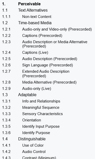
At first glance, the WCAG 2.2 guidelines can be overwhelming. There are about 100 separate items, ranked as an A, AA, or AAA standard. There are no clear-cut rules, like “use this size of text.” Instead,

The Section 508 website builds from this list of standards and tries to demystify them with concrete recommendations for US federal organizations or groups that do significant business with or as a conduit for federal organizations.

The European Accessibility Act (EAA) also leans on WCAG guidelines, but it reaches further than US Section 508, impacting any business or organization that purposefully communicates with audiences in the EU.

a screenshot of the first few dozen WCAG 2.2 accessibility standard titles, taken from https://www.w3.org/TR/WCAG22/

When it comes to actually following them, each standard is a discrete element that can be met or not met. The WC3 has also provided as much guidance as possible to simplify accessible designs without constraining the designs that can be implemented. Structurally, the top level of each criterion written with the assumption that a reader knows enough web design and communication theory to evaluate their own work. From there, linked pages offer more detailed advice, examples, and occasional tools to assess a document’s accessibility.

Guideline breakdown

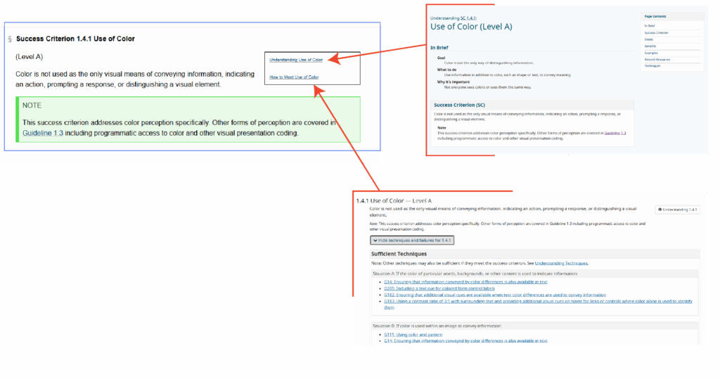
three screenshots of pages associated with WCAG guideline 1.4.1 Use of Color, including the success criterion, a page on understanding the criterion, and guidance to meet the criterion
There’s some irony in providing a text-heavy screenshot in the middle of a post on accessibility. See these pages for the originals: WCAG 2.2 Success Criterion 1.4.1 Use of Color, Understanding Use of Color, How to Meet Use of Color

Each standard is described as a success criterion, a simple is or is not statement that ought to describe a webpage, document, video, podcast, email, or other piece of web-based content. They include notes and subpages to help clarify the intent and goal of the criterion.

Success Criterion definition

The definition is meant to be easy to unpack. On use of color, we are told that color is not the only way that a page conveys some type of information. For example, if a webform indicates that some input is wrong (maybe an email address is incomplete or passwords don’t match), we typically highlight the form element in red, but we also need to add some other visual indicator like a ⚠ warning icon or a line of text alerting the user.

Importantly, the criteria are ranked by level. Level A criteria are bare minimum expectations for all content to meet (where applicable). Level AA are the standard expected by the European Accessibility Act, and many users would consider them the norm of web content design. Level AA standards are noticed when they are absent. Level AAA are the highest grade of accessibility. Meeting Level AAA standards may be beyond the technical capability of some content, and it may undermine the creative goals of other content.

Understanding the criterion

An definition page includes a thorough walkthrough, examples, notes on the intent of the criterion, and more. Critically, many criteria include test rules and free tools to evaluate different aspects of web content.

Using the criterion

The implementation page includes technical guides so designers without deep experience in multiple web languages can meet these success criteria. For instance, the Use of Color criterion points users to HTML and CSS code snippets to change webpage component appearance when they receive the “focus” attribute—like when a user with assistive technology scrolls through a page, when a user presses the tab key to move through elements on a page, or when they tap their screen

Do I need to meet them?

While WCAG sees these as guidelines, other governing bodies do see them as rules. The EAA fine structure applies to any organization doing business in an EU member state, and the EAA expects a meeting minimum of Level AA criteria at every possible instance.

Maybe more importantly, these guidelines are just plain good to follow. They make communication easier to consume and understand. They cut out the friction users might experience on a website or when enjoying a video or podcast. As web technical standards continue to evolve, the expectation will always be that people are trying to follow these guidelines—if you’re already trying to meet the guidelines, then the technical standards won’t be something you need to fight against.

How do I know if I’m meeting them?

Unfortunately, there aren’t many easy, one-click solutions. Paid services exist that will audit your website’s CSS and HTML files along with video and audio assets. To some degree, these standards are designed to make it easier for software to consume media, particularly in the case of assistive technologies like screen readers. But, in the end, these guidelines are written with a focus on making your content human consumable.

The best way to know if you’re meeting the guidelines is to stop asking whether you’re trying and start looking at (or listening to) your content from different viewpoints.

What’s a disability?

We often talk about accessibility as an extension of disabilities, but it is a bigger concept than simply meeting the needs of users with different ability levels. That said, it’s important to consider the core group of users that accessibility guidelines are designed to help.

The Typical Definition

Usually, we think of a disability as a missing or impaired ability common to most people. This is very limiting, and it hinders our ability to make good design decisions for al audiences.

For instance, On the web, vision impairment is a common concern. We may be talking about fully or functionally blind individuals accessing the web, or we might be talking about individuals with color blindness or extreme near-sightedness. Similarly, auditory or cognitive impairments cover wide spectra, any part of which can complicate consuming content. None of these specific instances cover some of the most common issues affecting web users.

The Real-World Definition

For many users, accessible designs mean they can get their phone to read emails out loud while they cook breakfast. Accessible designs mean a website will be clear and legible even on a monitor with poor contrast or color definition, or even with the brightness turned all the way down for night reading. Accessible video content has accurate subtitles and a complete, time-tagged transcript, so users can CTRL+F and find a specific piece of information as easily as they could in a text document.

In this sense, a “disability” (when considering our audience for web content) is actually any physical state, environmental context, or technological configuration that could impede someone’s ability to read, listen to, view, or interact with the content we create.

  • A noisy environment makes it difficult to hear a video, so the user turns on subtitles
  • A busy parent uses a screen reader to listen to emails and team chat channels before work while kids are getting ready
  • A customer is browsing several ecommerce sites at once, and they rely on well-thought out layouts and use of semantic tagging to easily compare features and prices

How do I prioritize these guidelines?

With 100 guidelines to follow, prioritization is key to managing an accessible design. When auditing the design of any media, a simple method of triage can help you reach your goal effectively. The example below shows the results of an audit I performed on a company’s email templates.

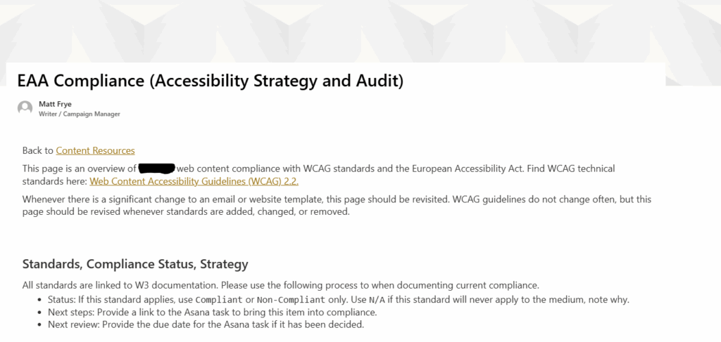
screenshot of the introduction of an intranet page holding accessibility audits of outbound and inbound marketing content

Successes

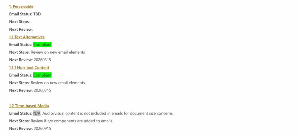
First, work through the list and document every criterion where you are already succeeding or that do not apply. If you’re already following common practices in your content, you likely meet many Level A and AA criteria. More importantly, these guidelines cover all web media, including video and podcast content. If your own content doesn’t include those technologies, you don’t need to worry about them.

Documenting successes will help thin the list to the things you need to address rather than providing and endless supply of things you can always improve on.

screenshot of several WCAG 2.2 accessibility criteria with notes indicating that some criteria are met or are not applicable to a communication strategy

Sidelines

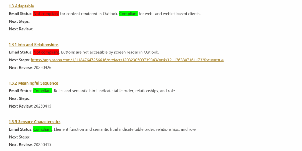
Next, honestly document the things that you are not in compliance with and that you don’t intend to be compliant with. Many Level AAA guidelines are difficult to achieve, and they can require significant changes to how you are planning your content in order to release them.

For instance, this page uses several screenshots of English text. If your computer’s or browser’s default language is not English, you might be reading a translated version of it, but your translator cannot read the content of those screenshots. I’d love to make this page more accessible to translators and screen readers, but the best I can do right now is the Level AA standard of providing detailed alternative text. I cannot meet the Level AAA standard of removing text from images entirely.

In some cases, you may be locked into non-compliance due to the technical limitations of your composing tools. Documenting this gives you an easy place to pick up should those technologies ever offer more accessibility features.

screenshot of several WCAG 2.2 accessibility criteria with notes that some items are non-compliant, a reason why they are non-compliant, and a reason why they should not be prioritized right now, typically owing to the limitation of the software used to consume the content

Struggles

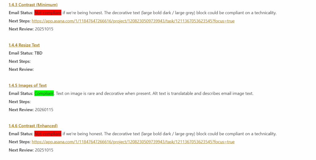
Finally, the real work begins: document the places where you are out of compliance and where you can improve. After the first two sweeps for Successes and Sidelines, the remaining list is unlikely to be onerous, but each item is something that will need to be addressed individually.

screenshot of several WCAG 2.2 accessibility criteria with notes that some items are non-compliant, a reason why they are non-compliant, and a date to bring them into compliance

What next?

If you want help with an accessibility audit or need some advice on meeting specific success criteria, let me know. I have a depth of experience finding and creating accessible solutions for web and print, particularly when the communication technology itself seems to impede every effort at improvement.

New year, new CSS: 2025 edition

I’ve spent a lot of years working in WordPress. I used it to build some early learning management systems (LMS, a specific type of CMS designed for classroom use) long before COVID made remote learning such a hot topic. I’ve used it to build hobby websites for table-top roleplaying games. I’ve used it to build simple web utilities for the family.

So, every year or so, I like to drop the active theme on my website and rebuild from as close to zero as possible. I use the underscores base theme created by the same folks behind many other WordPress utilities. It has the core pieces I need to determine layout, add some custom blocks, and keep up to date on the backend.

For the past year or two, I’ve felt too busy to keep up and I fell back on an old theme that had been gathering dust in my hard drive. As a result, the site itself gathered quite a bit of dust while I worked on other projects.

2025-2026 Goals

Between now and the autumn 2026, I’m shaking off the dust. Let’s make this blank slate something interesting to look at!

Design

First off, I need to hone some existing skills.

  • Build some custom blocks for portfolio pieces.
  • Build some automations to support a portfolio workflow.
  • Play around with grids and shaped divs.
  • Make the color scheme work for all visual abilities.

Then, let’s see if I can practice a few things that have changed or developed quite a bit since I last used them.

  • Complex responsiveness that listens to more than just screen width.
  • Real-time database interaction with jquery.
  • WooCommerce and ad integration.

Six goals, twelve months. Seems doable?

Content

Rather than test the design developments on some bland ipsum text, this website really needs to go back to holding some interesting content (even if it’s only interesting to me).

  • More portfolio pieces along each of my content management and campaign management skillsets—email campaigns, CRM work, data analysis, and more.
  • Some personal blogging. I’m tired of giving this content to social media companies for free!
  • Some professional blogging. I am living the lessons I taught as a professor, and maybe I ought to start documenting that stuff more publicly in case I return to the classroom someday.

Progress Tracking

In campaign and project management, I like to ensure that every goal, task, and outcome is explicitly defined and documented, so keep track of the New year, new css , Web design, and Content development in action tags to see how things are moving along.

A Penny Saved is an Hour Burned

This is a response piece, so let’s start with a summary of Victor Tangermann‘s You'll Spit Take When You Hear How Little Time Workers Are Saving With AI, According to This Huge New Study (https://futurism.com/time-workers-save-ai-jobs).

The Summary

In a big, big survey, researchers found that the total time savings we’re getting from jamming AI into every workflow we can find is less than 5% (or, for a typical workday, less than 25 minutes of saved time).

It’s possible that we are doing more productive work as a result of these tools, but very few people are getting bigger paychecks as a result.

Now, I’m a writer, but it’s been a long, long time since I sat with a pen in my hand to draft anything meaningful. I analyze marketing strategy stats, so I spend a lot of my workweek in Excel. I do a lot of web-based work but I grew up in the era of shareware, so I prefer to code and compile the tools I need rather than buy yet another plugin, add-on, or app to do a simple task for me.

In other words, I live in software. And, I love a good time-saving tool or hack, I really do. That said, Tangermann is spot on: my workflows have become flooded with unblockable, unstoppable “tools” that inject AI where it isn’t needed. The result? I spend unnecessary clicks, time, and mental energy trying to get my work done with what amounts to an overeager toddler at my side, making me long for the days when I could just turn Clippy off with two clicks.

Not a Luddite: AI Has a Place

I have a Statement on AI that lays out my professional boundaries for artificial intelligence, machine learning, and other algorithm-based tools. I’ll restate here that I really do like AI as a method for performing certain tasks, but I don’t think it fits every task.

My feelings about AI are a lot like my feelings about my Instant Pot. It can do so, so much stuff, and it can do a lot of that stuff well. It can’t do everything, though. In fact, there are many things I see people using Instant Pots for that are wildly inappropriate because we already have a better tool for the same task.

What is AI good for? Pattern recognition. I loved using BERT to analyze large corpora of text samples. It saved me a mountain of time working through student feedback when I was a professor, and it helped me understand where I spent most of my time commenting on student work.

What is AI not good for? Pattern creation. Generative AI can regurgitate a decent facsimile of existing material, but it can’t really create anything new or meaningful. That’s why chatbots have the potential to be useful (so long as they are given very low volatility values and a tightly curated training set). That’s why AI image generators can create vapid, space-filling stock photos pretty well. It’s why the “generative fill” tools in audio/visual software is pretty good at removing graffiti from brick walls.

In other words, AI can be useful in the right context, and it’s the most useful when someone chooses to turn that tool on. AI, like my Instant Pot, has the capacity to really ruin the day when it turns on without my knowledge or consent.

Lost Time

But how much friction are we talking about during the day?

Well, I launched Microsoft365.com today to hop into some Sharepoint content creation to support my team, to fire up Teams, and to launch a few company apps. Before I could get to any of those things, I had to get past the Copilot screen.

Notice that the three suggested tasks (Analyze this text and make suggestions… Write some funny OOO email replies… Rewrite this to sound more professional…) are not the things I need to do. Yet, the chatbot takes up 80% of the visual workspace, more if you count the Chat and Create menus in the left sidebar. Now, I get to wait for this bloated tool to load before I click Apps, a screen that comes with its own load time.

It’s the same in Asana: loading the page brings up a happy helper offering to summarize my day for me, but I’m a professional and I already know what I need to do. Teams wants to suggest new people and projects for me to check out. Outlook really wants to offer me an AI summary of an email full of technical details that I absolutely need to read as they were written by an engineer.

At every step, I have to tell the software “no,” I really do not want this additional function to run, or I want to you ignore the output of the function you’ve already run. I do not want assistance in doing the task that I am paid to do, that I know how to do, and that I opened a page or program to do.

Even worse, more than once every day I change tabs to work on another task rather than wait for the AI tool to finish loading its happy helper message, only to realize later in the day that Item 1 on my to-do list is still unchecked and I no longer have the brainpower to tackle the biggest problem of the day.

Old Man Rants at Clouds

These tools are here to stay, and I can be as angry with them as I was when every operating system decided rounded window edges were the new thing. But, if we are just focused on saving time or being more productive with these tools, maybe we ought to really ask if the tools are doing those things or if that’s just what the product packaging promises.

New year, new job, new posting schedule goals

Well, two years ago I made the jump from academia to industry, going from a teacher of professional writing to a professional writer.

I was pretty jazzed about the change back then, and I still am today. I work fewer hours, I’m less stressed, and I feel like I’ve built up some professional skills that were in a blind-spot for the last ten years.

About a month ago, a former manager pinged me on LinkedIn to ask if I’d be interested in a similar role at another company in town. I wasn’t unhappy at SEL, but the perks at METER sounded great, so here I am: a Writer/Campaign Manager in Marketing, now promoting scientific instruments for soil science, plant science, and meteorology.

New Year’s Resolution

Now that it’s January, I might as well make some resolutions.

My writing at SEL was kind of secret. Sure, I’ve got a portfolio of work I produced there, but there’s a mountain of internal or gated work that I’m not sharing. That’s just the nature of that industry. METER seems a little less secretive so far, so I’ll aim for a weekly rundown of what it is I do as a Writer and as a Campaign Manager—specifically with an eye towards my past self or other writing teachers who need a window into the day-to-day of someone who writes for a living.

Along with that goal, I’ll head back to rhetoricalstuff.com and start fleshing out a lot more of the pages I used when I was teaching. This blog will be a professional diary, but that space will provide the heavier theory behind what I do.

This means that Grimgosh, my tabletop RPG project, continues to ride in the back seat. The winds are shifting in the ttRPG world, though. Is there space for another project outside the widely-accepted d20 ruleset? More importantly, I’m predicting that Hasbro’s drive to get everything into their D&D Online platform (or whatever it’s called) is going to sour a lot of folks on that IP. Does that mean there’s room for a gaming system and setting where all of the resources are freely available? We’ll see. That’ll be my personal marketing goal.

Milestones and Metrics

Take it from a former assessment expert: goals are meaningless without measurements and deadlines. Here are my deadlines for 2024, not including the ones I’m paid to meet.

WeekFryespot PostRhetorical Stuff PostGrimgosh Development
Jan 14Pardot From the Inside——
Jan 21KairosCharacter Creation
Jan 28——
Feb 4—
Feb 11—
Feb 18—
Feb 25——
Mar 3
Mar 10——
Mar 17—
Mar 24—
Mar 31—
Apr 7——
Apr 14
Apr 21——
Apr 28—
May 5—
May 12—
May 19——
May 26
Jun 2——
Jun 9—
Jun 16—
Jun 23—
Jun 30——
Jul 7
Jul 14——
Jul 21—
Jul 28—
Aug 4—
Aug 11——
Aug 18
Aug 25——
Sep 1—
Sep 8—
Sep 15—
Sep 22——
Sep 29
Oct 6——
Oct 13—
Oct 20—
Oct 27—
Nov 3——
Nov 10
Nov 17——
Nov 24—
Dec 1—
Dec 8—
Dec 15——
Dec 22
Dec 29Year End Recap—

Don’t Sell the Table Propositions

There’s a great xkcd comic from years and years ago. In fact, now that I’m writing this sentence, I realize that I used to show it to my basic writing students. The idea was that you can make an argument without saying it explicitly—in this case, that the other guys put asbestos in their cereals, but not good ol’ Red Farm!

https://xkcd.com/641/

More than that, though, there’s a question about GenCo and Stay Puft brands. Why not also note that they are asbestos free, right? Easy enough. Slap a label on the box and call it a day.

Odds are there’s no broken glass in there. No bacon bits. No PCP. No fragments of the Magna Carta.

The technical writer in me would say that it’s because the list of what isn’t in oat cereal is too long to make an exhaustive graphic on the box, but the marketing writer in me knows that it’s because those are all table propositions.

Nobody Wants Your Table Proposition

I heard through the grapevine at work that one of the company executives didn’t want us to include basic expectations in marketing and sales materials, especially those with any kind of limited real estate. For example, if you’re selling a car in the year 2023, you don’t want to lead the features list with “seat belts” or “front-facing lights to illuminate the road at night.”

Those aren’t selling points. They are requirements.

As a teacher, I called them “reverse extra credit.” You aren’t getting points for having them, but you sure are losing points for omitting them.

These are the propositions for your product, solution, service, or whatever that you need in order to have a seat at the table. So, if your marketing materials are showing up in front of an audience, they assume you meet those minima.

In other words, if I walk on to your used car lot, you’d better be ready to show me something with an engine and tires, or I’m going to be pretty upset.

Who Is Selling These Things?

It shouldn’t be any surprise that I pay a lot of attention to the words people use to sell me stuff. I also disable ad blockers when I’m browsing the web because I want to see the messaging other folks put together. Naturally, I love the way the Great Algorithm decides what I need to see.

I’m also kind of lazy. I’ll check the website of a big box store before I drive across town (or, as happens here in Pullman, across state lines) to see if something is in stock. That leads to ads for really basic products coming across my feeds.

This is the product page for some exterior screws. I’ve got a fence that really needs to be torn down and rebuilt, but for now, it’s patchy patchy time.

These exterior screws, it says, are great for exterior wood to wood expplications. They are ideal for use in outdoor construction.

No way!

Those are table propositions. If I’m buying exterior screws, those are bare minimum requirements.

Why write them? Well, in this case, what else do you write? How do you differentiate one set of three inch exterior screws from another?

Fix It: Find the Benefits!

Let’s back up and think about this product over others. The Grip Rite brand is not the most expensive. That is a benefit—Economical fastener option. This is also not really a contractor-grade or carpenter-grade product. This is a box of screws that a homeowner buys for a summer project, then keeps in the garage for a few years until they’re all either lost or used up.

With that in mind, I’m a homeowner. Guess what I do for every single woodworking project that requires screwing things together. That’s right! I dry fit the boards and blocks together, then place a screw next to them. Three inches is enough to fasten a pair of 2x4s together (a nominal 2″ depth means a 1-1/2″ real depth, says my civil engineer spouse). Put that on the page! Don’t make me guess in the fastener aisle whether a 2-1/2″ screw will be enough. Effective fastening of up to 2″ dimensional lumber.

Philips slot, bugle head? That’s right, it fits common Philips drive heads and the head won’t protrude from the project surface!

Sharp point? Drives without pilot holes. Polymer coated? Drives smoothly and won’t corrode.

Here’s a better benefit to address: what project can I finish with this box of wood screws? Do I need one to finish this deck or will I come back for a second? If I buy two, will I be moving an unopened box of screws around my garage for the next decade?

Man, those U-Haul folks really figured this one out.

“Mom’s Attic” size

That’s what the other guy said!

Now, none of those benefits are specific to the Grip Rite product, but neither are those features. The only specific things to this product are the box price and quantity. Instead, the question is whether I want to spend $30 on the Grip Rite box or more than that on the Simpson Strong Tie box.

Do I Need to Fix This?

Yes.

Ultimately, what are you really selling? The oat cereals at the top of this post are selling breakfast. There might not be anything that’s really differentiating them, sort of like how there’s very little differentiating Cheerios from Malt-o-Meal Honey Os.

In those arenas, price is the differentiator. Everything else is a table proposition. I see a box or a bag of honey-sweetened oat cereal, I know what to expect.

But, simply listing off the expected features doesn’t really help anyone. Even worse, simply listing off features eats up valuable page real estate and attention from your audience where you could be making a meaningful connection to their problem.

Don’t sell your table propositions!

Spec: Social Media Seating by Xnorb

The Products

You’re here to see what I can make, not my walkthrough! Here is a brief client description from ChatGPT followed by the products.

Create a detailed creative brief for a Social Media and Technology company selling Office chairs. This new offering debuts near Cinco de Mayo. Please use this audience profile as the primary audience for marketing:   
  Business Profile:
      Name: ABC Fitness Studio
      Industry: Fitness and Wellness
      Budget: Moderate
      Geographic Location: Austin, Texas, USA
      Demographics: B2C, Small business

Day 1: Social Post

I needed to figure out what the core message was for this chair, so I started with a social post. I settled on the idea of a “spotter” as a connection between the chair’s ergonomic benefits and the interests of a fitness company.

This first example is a splash image with some simple, problem/benefit copy. Ideally, I would like images that are a little more evocative of a fitness center (maybe someone lifting weights in their office chair).

This mockup is a little more typical of what I do regularly as a writer — I focus on creating the post content, while the Design team and Content Strategy teams find the right image. I chose this stock photo because it is repeated on the landing page, creating a consistent experience for readers going from one platform to another.

Day 2: Blog Post

With a social post in place, now I needed to write a blog post or landing page that would capture the broad sweep of traffic generated by a social post. Without testimonials or other real information about this chair, I went with a landing page to collect traffic. This gives an opportunity to add a little life to the product and highlight some key benefits.

This was quickly laid out using Adobe Express and Illustrator. I’m not a huge fan of the visuality, but I’m also trying to spec out one thing every day.

This landing page emphasizes ergonomics (the message from the social post)

Day 3: The Email

Email drafting is underway…

This email will be written specifically to ABC Fitness Studio, though it could be generalized to other fitness center businesses. Because this is a more direct pitch to executives for the product, I will emphasize the affordability and productivity points more than ergonomics. Ergonomics are important, but at the b2b level, I want to emphasize how this chair supports ABC Fitness Studio’s goal of fostering productivity in their media teams.

Day 4: The Review

So, is this a complete package for my client? Let’s review the pieces once they’re all uploaded to the page.

The Write Up

This is the first spec ad in this little shenanigan, so I’m going to start by listing the three options my spreadsheet gave me today. These are the exact prompts I will feed into ChatGPT.

Option 1 (social media office chairs for a gym?!) seems the most interesting, so let’s run with that.

[su_spoiler title=”Option 1: Social media company selling chairs” icon=”arrow-circle-1″]

Create a detailed creative brief for a Social Media and Technology company selling
Office chairs. This new offering debuts near Cinco de Mayo. Please use this audience profile as the primary audience for marketing:
  Business Profile: 
    Name: ABC Fitness Studio 
    Industry: Fitness and Wellness 
    Budget: Moderate 
    Geographic Location: Austin, Texas, USA 
    Demographics: B2C, Small business

[/su_spoiler]

[su_spoiler title=”Option 2: Logistics company selling cameras” icon=”arrow-circle-1″]

Create a detailed creative brief for a Transportation and Logistics company selling  
Digital cameras. This new offering debuts near Glastonbury Festival (United Kingdom). Please use this audience profile as the primary audience for marketing: 
  Business Profile: 
    Name: Smith & Associates Law Firm 
    Industry: Legal Services
    Budget: High 
    Geographic Location: Sydney, Australia 
    Demographics: B2B, Medium-sized company

[/su_spoiler]

[su_spoiler title=”Option 3: Entertainment company selling shirts” icon=”arrow-circle-1″]

Create a detailed creative brief for a Entertainment company selling  
T-shirts. This new offering debuts near Valentine's Day. Please use this audience profile as the primary audience for marketing: 
  Individual Profile: 
    Name: Robert Davis 
    Interests: Fitness, nutrition, outdoor activities 
    Budget: Moderate Geographic 
    Location: Sydney, Australia 
    Demographics: Male, 45 years old

[/su_spoiler]

Process

First, we generate the creative brief. I already know that I’m trying to figure out how Cinco de Mayo fits in here, or if it even does. Maybe it’s just a spring-time sale.

The Creative Brief

For those interested, this is what ChatGPT gave in response to the Option 1 prompt above. I’ve bolded the things I’ll really be focusing on.

It’s important to note that this brief wants a social media post, a blog post, and some interactions with events and influencers. Two of those are not possible in this exercise.

[su_spoiler title=”Creative Brief” icon=”arrow-circle-1″]

Creative Brief: Office Chair Marketing Campaign for ABC Fitness Studio

Client: The client is a Social Media and Technology company that is introducing a new line of office chairs. They aim to target ABC Fitness Studio, a small business in the fitness and wellness industry, located in Austin, Texas, USA. The client’s objective is to market their office chairs to ABC Fitness Studio, aligning the product with the studio’s brand image and catering to their budget and needs.

Objective: The primary objective of the marketing campaign is to successfully introduce and promote the new line of office chairs to ABC Fitness Studio. The client aims to position their office chairs as the ideal solution for businesses in the fitness and wellness industry, emphasizing comfort, ergonomics, and affordability. The goal is to generate sales and establish long-term partnerships with similar businesses in Austin, Texas.

Target Audience: The target audience for this campaign is small businesses in the fitness and wellness industry, with a focus on ABC Fitness Studio in Austin, Texas. The audience consists of decision-makers or managers responsible for purchasing office furniture. The demographics include business-to-consumer (B2C) small businesses, primarily located in the local geographic area.

Key Message: The key message for the campaign should revolve around the following points:

  1. Elevate your workspace with ergonomic office chairs designed for fitness and wellness businesses.
  2. Maximize comfort and productivity for your employees and clients.
  3. Affordable solutions that cater to your budget without compromising on quality.
  4. Create a professional and inviting atmosphere for your fitness studio.

Creative Considerations:

  1. Theme and Tone:
    • The theme should incorporate elements of fitness and wellness, featuring vibrant colors, active individuals, and a dynamic atmosphere.
    • The tone should be energetic, professional, and focused on promoting a healthy work environment.
  2. Visual Imagery:
    • Use visuals that showcase fitness-related activities and a productive office environment within a fitness studio.
    • Highlight employees and clients using the office chairs comfortably while working or engaging in fitness-related tasks.
  3. Channels and Campaign Components:
    • Social Media Marketing: Utilize platforms such as Facebook, Instagram, and LinkedIn to reach the target audience. Create engaging content, including images, videos, and testimonials.
    • Content Marketing: Develop blog posts or articles that discuss the importance of ergonomic office chairs in the fitness and wellness industry, featuring ABC Fitness Studio as a case study.
    • Influencer Partnerships: Collaborate with fitness influencers or local wellness experts who can endorse the office chairs, sharing their experiences with the product.
    • Email Marketing: Send targeted email campaigns to fitness and wellness businesses in the Austin area, introducing the office chairs and offering exclusive discounts or promotions.
    • Local Events: Participate in local business events or trade shows related to fitness and wellness, showcasing the office chairs and their benefits.
  4. Messaging:
    • Emphasize the ergonomic features of the office chairs, highlighting their ability to promote proper posture and reduce discomfort during long work hours.
    • Communicate the importance of creating a productive and inviting workspace for employees and clients within the fitness and wellness industry.
    • Showcase the affordability and value of the office chairs, catering to small businesses with a moderate budget.

Timeline: The marketing campaign will run from April to June, with a focus on the weeks leading up to Cinco de Mayo to align with the product debut. The campaign will continue beyond Cinco de Mayo to ensure continued brand exposure and engagement.

Budget: The client has allocated a moderate budget for the campaign, covering social media advertising, influencer collaborations, content creation, email marketing, and event participation expenses. The budget will also include creative development, production, and promotional materials.

Key Success Metrics:

  1. Increase in inquiries and sales from fitness and wellness businesses, particularly ABC Fitness Studio.
  2. Positive feedback and testimonials from satisfied customers.
  3. Growth in social media engagement, including likes, comments, shares, and followers.
  4. Successful partnerships with influencers and local wellness experts.
  5. Increase in brand awareness within the fitness and wellness industry in Austin, Texas.

By adhering to this creative brief, the Social Media and Technology company can effectively market their office chairs to ABC Fitness Studio and similar small businesses in the fitness and wellness industry.

[/su_spoiler]

The Approach

I’ll end up creating a social post for Facebook and Instagram that directs readers to the blog post, as well as an email meant for fitness studios, also directing them to the blog post. The blog post will include a link to the product.

I will be using Stable Diffusion, Adobe Photoshop, and Adobe Illustrator to generate images, and I’ll use Adobe InDesign to lay things out. Whenever Stable Diffusion can’t generate something useful, I’ll use Pexels.com for free material. The image’s description will have more detail about the source.

Spec a Day

As a writing teacher, it was always fun to assign speculative projects — write an OSHA safety report for Mickey Mouse’s funhouse, write a technical paper describing the advantages of a sub-style sandwich over a sliced-bread sandwich, create a henchmen recruiting website for a supervillain.

Spec Ad Creation Process

Unfortunately, I’m not great at coming up with totally random things, so I’ve enlisted the help of ChatGPT and some spreadsheet software. You can find my spreadsheet here. The lists of industries, audiences, products, and timings are all generated by ChatGPT (again, not great at random generation here), and the spreadsheet just pulls a random item from each list either (a) when you load the page or (b) when you re-calculate the sheet.

The sheet generates three prompts for ChatGPT, requesting a creative brief with those details. A creative brief includes all of the detail necessary for a project. Because this is all being mad-libbed together, I’m asking the Google Sheet to create 3 prompts, and then I’ll pick one from that set each day I’m able to set aside time for a spec.

  • Spec: Social Media Seating by Xnorb

    The Products You’re here to see what I can make, not my walkthrough! Here is a brief client description from ChatGPT followed by the products. Day 1: Social Post I needed to figure out what the core message was for this chair, so I started with a social post. I settled on the idea of…

  • Spec a Day

    As a writing teacher, it was always fun to assign speculative projects — write an OSHA safety report for Mickey Mouse’s funhouse, write a technical paper describing the advantages of a sub-style sandwich over a sliced-bread sandwich, create a henchmen recruiting website for a supervillain. Spec Ad Creation Process Unfortunately, I’m not great at coming…

Letting the Algorithm Work

One of my strategies for mini-breaks through the day is to just fire up a new tab in my browser and scroll through headlines, weather, and whatever else the New Tab utility decides to grab. I use Edge as my work browser, and I don’t have as much control over what happens this space as I do in Firefox or other browsers.

And, that’s a nice thing. It means I can’t ever spend time optimizing this tool, and I can’t limit the amount of visual or rhetorical noise it makes. A new tab is like a mental palate cleanser. Spending a few minutes clicking through headlines, ads, weather, NextDoor posts, and whatever else the Edge developers think I need is a great way to stop thinking about one thing and move on to another.

Every once in while, though, something will come across the feed that’s really… weird.

The other day, this story came across the headline feed. The story itself didn’t grab my attention so much as the visual did. It reminded me of reading order activities I’d do when I taught tech writing and digital design classes. The gist is that, regardless of someone’s primary language, we don’t actually read left to right, top to bottom (or right to left, top to bottom; or top to bottom, right to left). We process the full object first to recognize that there is even text to begin with.

The folks at Michigan Creative explain it well.

Generally, that means we look at the middle of an image/space and then process the stuff around it. We are drawn to the biggest, highest-contrast points (the bright spots in a dark image, or the dark spots in a bright one). We are drawn to the intersections of lines or the intersections of white spaces.

We figure out what the whole thing is first, then we look for text.

We read the big text first, then we look for supporting points.

We start with big, simple, different elements because they tend to be the most important things to pay attention to, and they usually have the core information we need.

In this news headline, the first thing we really see is a divider line between two bald heads. And, if you’re scrolling quickly, you might not notice them as bald heads at first. I’ll be honest here: I thought it was a butt.

This makes the rest of the message a little weird if I don’t spend the time to really unpack what I’m looking at. All of this processing happens in a few milliseconds, and it’s just our mind’s way of figuring out what’s happening around us.

So, I see a butt or bald heads, and below it, text is superimposed over the core parts of the face that people use to recognize one another (eyes, nose, mouth, etc.). Something about a “fragile truce” halting what the world thought was going to be a 21st century Russian Revolution.

Again, processing takes milliseconds. Butt? Bald heads? Fragile truce. Halting armed revolt.

How do these things connect? Was the truce based on baldness? Was the armed revolt a hair thing?

A few seconds later, I connected the dots and remembered everything else I’d been reading about the Prigozhin/Wagner Group/Putin story and moved on, but this did confuse me for just a moment.

Good palate cleanser.

But wait! What’s the lesson?

The important thing about this graphic is that it wasn’t anyone’s fault. The headline is a good attention-getter. The graphic in the story is a useful tool to identify the main actors. But, the headline widget in Edge’s New Tab does a weird thing when it pulls this content.

Tools like this rely on simple algorithms to look for popular news stories (most reactions or shares or some other metric), then they grab the headline and the largest image on the page (typically the Hero Image or a similarly tagged item at the very top of the page).

The algorithm composites them together into a single block with the image as the background and the headline as a bottom-aligned line of text. The images are usually very large, so there’s some zooming and cropping to focus on what is likely to be the most important part of the image (usually just some math based on the rule of thirds).

Now, some websites take advantage of this algorithm and actually craft their headlines and choose their images to get the most clicks from a tool like this. Edge isn’t the only game in town, and we’ve all seen “Top Headlines” widgets across the web. So, we’re used to seeing things that are put together well.

It’s just really fun to stop and notice when the algorithm gets things weird and consider how this might inform projects later on.

In this case, is there a lesson? Not really. Whenever a publication process is out of your control, all you can do is hope your original material is designed robustly enough that nothing is goofed in the process.

Twitter Famous

I write a fair amount of social media posts as part of my job, and I won’t lie: I always get excited when I see them come up in one of my feeds.

I used to teach and assess writing, though, so I always wonder what makes my work perform well or poorly—and, in the case of social media, I wonder what “performing well” really means. Honestly, that issue alone makes social media writing one of the most challenging parts of my job. Good reason to dive in and see what’s happening rhetorically!

Anatomy of a Post

It’s 2023, and I think we’re all pretty aware of what a social media post looks like. In the interest of good writing and explaining what I have control over as a content writer, though, let’s run through the parts really quick.

  1. The posting profile is at the top of the post, including a name and profile picture. LinkedIn provides a follower count. I have no control over these things.
  2. The post content. This is what I write.
  3. A “call to action” or CTA. This tells the reader what to do in response to the info they’re looking at.
  4. Hashtags! LinkedIn posts prefer hashtags at the bottom, Twitter embeds them in the post, Facebook does… something?
  5. The post image. I can provide some input as a writer, but this isn’t something I control. (In fact, for many posts, I’m told what the image will be to ensure the text and graphic work together.)
  6. The post link text. I don’t control this, but our social media team can change it using a common <meta> element in the linked page’s <head>. I can make suggestions, and the social team and I usually work together to make sure the link text works well with the post text.

I cut off the number of reactions in the big picture, but you can see in the version at the top that there were 8 likes at the time I grabbed this.

Like and Subscribe: A Measure of Success?

So, maybe to start this out… is a post that gets 8 likes in 17 hours successful?

This post is part of a series. We are really looking for folks to fill specific manufacturing positions, and maybe LinkedIn is not the right example to grab for this.

34 likes in 2 days on a different platform, which is better, but not quite viral.

I’m leaving all of the examples in here because these are part of a cluster of posts, each highlighting something different about the workplace, each intended to attract a specific type of applicant. This one was posted to the company’s community page on Facebook (different from its technical page, which has a large audience of engineers).

Part of the goal here was not to reach just the initial audience but passed them. Folks like the commenter and other community members provide an extra level of reach through their likes, interactions, and shared visibility with their own contacts. Ideally, by reaching members of the community who are already favorably disposed towards the company, we’d also have some reach into folks who may be positively predisposed but not actively connected on social media.

With that in mind, a few likes and comments are a success. We continue to get applicants at a sustainable rate, and the posts in this cluster are continuing to go out as planned.

Rhetorical Breakdown

This post, like most social media posts, works because of a few simple rhetorical mechanics.

It has the right ethos, both in the sense that the original post comes from the company that’s hiring and that any shares or extended visibility come from people who are known to the end-contact. This isn’t a random LinkedIn recommendation about a company that’s hiring. This is especially important at a time when workers are conscious of their value and won’t accept just any employer.

It builds on some pathos or existing dispositions and values in the audience. Both of these posts (all of them in the cluster, too) emphasize growth on the job: training, mentorships, and apprenticeships. Some posts talk about other benefits, including retirement benefits that exist for everyone. These posts emphasize that employment is a means to more than a paycheck, and that employment isn’t a revolving door of lowest-bidders for work.

There’s a sense of cause-and-effect in the logos of the posts, as well, beyond simply work –> paycheck. There’s an additional effect of work –> advancement, supporting both of the earlier points that this is an environment for long-term growth.

Was that intentional? You bet.

It’s been over a year since I was on the job market. I remember getting ghosted, which is why it was a relief to get to write that qualified interviewees get offers the same day. I also remember thinking long and hard about whether I’d have the same opportunity for skill growth that I had as a teacher (in that I was always teaching some new technology or tool that I had to learn first), so I enjoyed getting to write that growth was basically guaranteed for everyone.

Lessons Learned?

There is always something new to learn in every project. This wasn’t my first social post or even my first “we’re hiring” social post. But, in composing four of these back-to-back, I remembered a lesson in writing short-form documents like this: find your key takeaway, and don’t let anything distract from that.

There are a lot of moving parts in each of these posts. A core message, like “we support your growth.” Company messaging, like the “we make electric power safer, more reliable, and more economical” mission statement. Supporting factoids, like mentorships and training to support growth. Logistical detail, like same-day job offers.

All of these parts have to come together without sounding like a pile of parts. They need to tell a story in a few dozen words, and the moral of that story has to be the core message in the graphic: we support your growth.

In the classroom, there are lots of neat tricks we can do to meet the messaging goal under the most visible constraint: post length. We grab a thesaurus and swap 20 characters for 10, not thinking about the rarity of specific words. (When you’re a writing/communication/English/media major, you appreciate those words when you see them.) We combine clauses and gloss over “obvious” parts of a message. In many ways, we forget the audience when we’re in a classroom because we never see the likes and reactions on the other end.

We miss authentic responses and engagement, which is really the thing that these posts are meant to provoke.

css.php