
Accessibility Audits: Money in your pocket

The W3 Consortium maintains a list Web Content Accessibility Guidelines. Similar to the web and print communication requirements of the US Rehabilitation Act section 508, these these are broad goals for any piece of outbound or inbound communication.

But, if your content isn’t directed at folks with known disabilities, are these guidelines actually important? Yes, and for more reasons than you might think.

  • Not meeting accessibility guidelines locks large segments of your potential audience out of your content
  • Meeting accessibility guidelines allows members of your target audience to use your content in more ways that meet their needs at the moment
  • Ignoring accessibility guidelines can mean fines or a suspension of business in some countries

What are these guidelines?

At first glance, the WCAG 2.2 guidelines can be overwhelming. There are about 100 separate items, ranked as an A, AA, or AAA standard. There are no clear-cut rules, like “use this size of text.” Instead,

The Section 508 website builds from this list of standards and tries to demystify them with concrete recommendations for US federal organizations or groups that do significant business with or as a conduit for federal organizations.

The European Accessibility Act (EAA) also leans on WCAG guidelines, but it reaches further than US Section 508, impacting any business or organization that purposefully communicates with audiences in the EU.
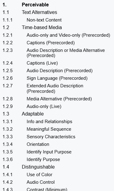
a screenshot of the first few dozen WCAG 2.2 accessibility standard titles, taken from https://www.w3.org/TR/WCAG22/

When it comes to actually following them, each standard is a discrete element that can be met or not met. The WC3 has also provided as much guidance as possible to simplify accessible designs without constraining the designs that can be implemented. Structurally, the top level of each criterion written with the assumption that a reader knows enough web design and communication theory to evaluate their own work. From there, linked pages offer more detailed advice, examples, and occasional tools to assess a document’s accessibility.

Guideline breakdown
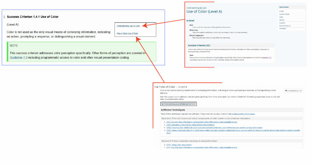
three screenshots of pages associated with WCAG guideline 1.4.1 Use of Color, including the success criterion, a page on understanding the criterion, and guidance to meet the criterion
There’s some irony in providing a text-heavy screenshot in the middle of a post on accessibility. See these pages for the originals: WCAG 2.2 Success Criterion 1.4.1 Use of Color, Understanding Use of Color, How to Meet Use of Color

Each standard is described as a success criterion, a simple is or is not statement that ought to describe a webpage, document, video, podcast, email, or other piece of web-based content. They include notes and subpages to help clarify the intent and goal of the criterion.

Success Criterion definition

The definition is meant to be easy to unpack. On use of color, we are told that color is not the only way that a page conveys some type of information. For example, if a webform indicates that some input is wrong (maybe an email address is incomplete or passwords don’t match), we typically highlight the form element in red, but we also need to add some other visual indicator like a ⚠ warning icon or a line of text alerting the user.

Importantly, the criteria are ranked by level. Level A criteria are bare minimum expectations for all content to meet (where applicable). Level AA are the standard expected by the European Accessibility Act, and many users would consider them the norm of web content design. Level AA standards are noticed when they are absent. Level AAA are the highest grade of accessibility. Meeting Level AAA standards may be beyond the technical capability of some content, and it may undermine the creative goals of other content.

Understanding the criterion

An definition page includes a thorough walkthrough, examples, notes on the intent of the criterion, and more. Critically, many criteria include test rules and free tools to evaluate different aspects of web content.

Using the criterion

The implementation page includes technical guides so designers without deep experience in multiple web languages can meet these success criteria. For instance, the Use of Color criterion points users to HTML and CSS code snippets to change webpage component appearance when they receive the “focus” attribute—like when a user with assistive technology scrolls through a page, when a user presses the tab key to move through elements on a page, or when they tap their screen

Do I need to meet them?

While WCAG sees these as guidelines, other governing bodies do see them as rules. The EAA fine structure applies to any organization doing business in an EU member state, and the EAA expects a meeting minimum of Level AA criteria at every possible instance.

Maybe more importantly, these guidelines are just plain good to follow. They make communication easier to consume and understand. They cut out the friction users might experience on a website or when enjoying a video or podcast. As web technical standards continue to evolve, the expectation will always be that people are trying to follow these guidelines—if you’re already trying to meet the guidelines, then the technical standards won’t be something you need to fight against.

How do I know if I’m meeting them?

Unfortunately, there aren’t many easy, one-click solutions. Paid services exist that will audit your website’s CSS and HTML files along with video and audio assets. To some degree, these standards are designed to make it easier for software to consume media, particularly in the case of assistive technologies like screen readers. But, in the end, these guidelines are written with a focus on making your content human consumable.

The best way to know if you’re meeting the guidelines is to stop asking whether you’re trying and start looking at (or listening to) your content from different viewpoints.

What’s a disability?

We often talk about accessibility as an extension of disabilities, but it is a bigger concept than simply meeting the needs of users with different ability levels. That said, it’s important to consider the core group of users that accessibility guidelines are designed to help.

The Typical Definition

Usually, we think of a disability as a missing or impaired ability common to most people. This is very limiting, and it hinders our ability to make good design decisions for al audiences.

For instance, On the web, vision impairment is a common concern. We may be talking about fully or functionally blind individuals accessing the web, or we might be talking about individuals with color blindness or extreme near-sightedness. Similarly, auditory or cognitive impairments cover wide spectra, any part of which can complicate consuming content. None of these specific instances cover some of the most common issues affecting web users.

The Real-World Definition

For many users, accessible designs mean they can get their phone to read emails out loud while they cook breakfast. Accessible designs mean a website will be clear and legible even on a monitor with poor contrast or color definition, or even with the brightness turned all the way down for night reading. Accessible video content has accurate subtitles and a complete, time-tagged transcript, so users can CTRL+F and find a specific piece of information as easily as they could in a text document.

In this sense, a “disability” (when considering our audience for web content) is actually any physical state, environmental context, or technological configuration that could impede someone’s ability to read, listen to, view, or interact with the content we create.

  • A noisy environment makes it difficult to hear a video, so the user turns on subtitles
  • A busy parent uses a screen reader to listen to emails and team chat channels before work while kids are getting ready
  • A customer is browsing several ecommerce sites at once, and they rely on well-thought out layouts and use of semantic tagging to easily compare features and prices

How do I prioritize these guidelines?

With 100 guidelines to follow, prioritization is key to managing an accessible design. When auditing the design of any media, a simple method of triage can help you reach your goal effectively. The example below shows the results of an audit I performed on a company’s email templates.
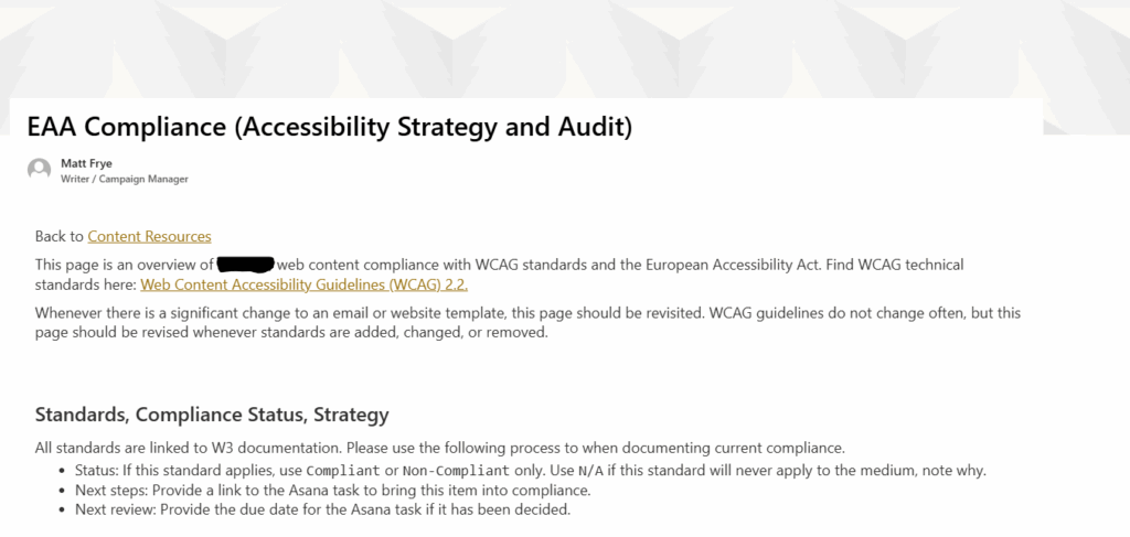
screenshot of the introduction of an intranet page holding accessibility audits of outbound and inbound marketing content

Successes

First, work through the list and document every criterion where you are already succeeding or that do not apply. If you’re already following common practices in your content, you likely meet many Level A and AA criteria. More importantly, these guidelines cover all web media, including video and podcast content. If your own content doesn’t include those technologies, you don’t need to worry about them.

Documenting successes will help thin the list to the things you need to address rather than providing and endless supply of things you can always improve on.
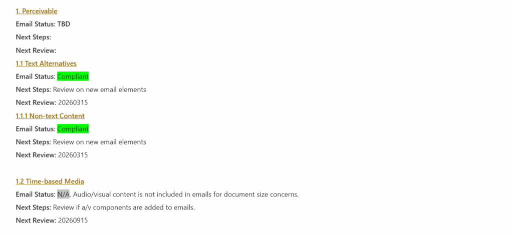
screenshot of several WCAG 2.2 accessibility criteria with notes indicating that some criteria are met or are not applicable to a communication strategy

Sidelines

Next, honestly document the things that you are not in compliance with and that you don’t intend to be compliant with. Many Level AAA guidelines are difficult to achieve, and they can require significant changes to how you are planning your content in order to release them.

For instance, this page uses several screenshots of English text. If your computer’s or browser’s default language is not English, you might be reading a translated version of it, but your translator cannot read the content of those screenshots. I’d love to make this page more accessible to translators and screen readers, but the best I can do right now is the Level AA standard of providing detailed alternative text. I cannot meet the Level AAA standard of removing text from images entirely.

In some cases, you may be locked into non-compliance due to the technical limitations of your composing tools. Documenting this gives you an easy place to pick up should those technologies ever offer more accessibility features.
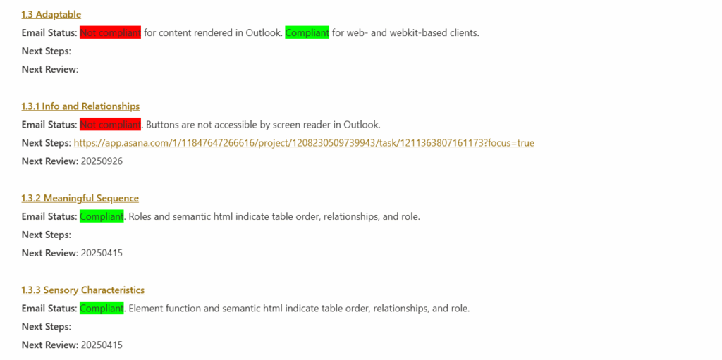
screenshot of several WCAG 2.2 accessibility criteria with notes that some items are non-compliant, a reason why they are non-compliant, and a reason why they should not be prioritized right now, typically owing to the limitation of the software used to consume the content

Struggles

Finally, the real work begins: document the places where you are out of compliance and where you can improve. After the first two sweeps for Successes and Sidelines, the remaining list is unlikely to be onerous, but each item is something that will need to be addressed individually.
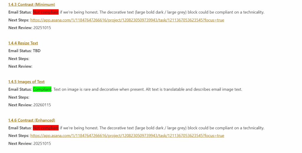
screenshot of several WCAG 2.2 accessibility criteria with notes that some items are non-compliant, a reason why they are non-compliant, and a date to bring them into compliance

What next?

If you want help with an accessibility audit or need some advice on meeting specific success criteria, let me know. I have a depth of experience finding and creating accessible solutions for web and print, particularly when the communication technology itself seems to impede every effort at improvement.

Don’t Sell the Table Propositions

There’s a great xkcd comic from years and years ago. In fact, now that I’m writing this sentence, I realize that I used to show it to my basic writing students. The idea was that you can make an argument without saying it explicitly—in this case, that the other guys put asbestos in their cereals, but not good ol’ Red Farm!

https://xkcd.com/641/

More than that, though, there’s a question about GenCo and Stay Puft brands. Why not also note that they are asbestos free, right? Easy enough. Slap a label on the box and call it a day.

Odds are there’s no broken glass in there. No bacon bits. No PCP. No fragments of the Magna Carta.

The technical writer in me would say that it’s because the list of what isn’t in oat cereal is too long to make an exhaustive graphic on the box, but the marketing writer in me knows that it’s because those are all table propositions.

Nobody Wants Your Table Proposition

I heard through the grapevine at work that one of the company executives didn’t want us to include basic expectations in marketing and sales materials, especially those with any kind of limited real estate. For example, if you’re selling a car in the year 2023, you don’t want to lead the features list with “seat belts” or “front-facing lights to illuminate the road at night.”

Those aren’t selling points. They are requirements.

As a teacher, I called them “reverse extra credit.” You aren’t getting points for having them, but you sure are losing points for omitting them.

These are the propositions for your product, solution, service, or whatever that you need in order to have a seat at the table. So, if your marketing materials are showing up in front of an audience, they assume you meet those minima.

In other words, if I walk on to your used car lot, you’d better be ready to show me something with an engine and tires, or I’m going to be pretty upset.

Who Is Selling These Things?

It shouldn’t be any surprise that I pay a lot of attention to the words people use to sell me stuff. I also disable ad blockers when I’m browsing the web because I want to see the messaging other folks put together. Naturally, I love the way the Great Algorithm decides what I need to see.

I’m also kind of lazy. I’ll check the website of a big box store before I drive across town (or, as happens here in Pullman, across state lines) to see if something is in stock. That leads to ads for really basic products coming across my feeds.

This is the product page for some exterior screws. I’ve got a fence that really needs to be torn down and rebuilt, but for now, it’s patchy patchy time.

These exterior screws, it says, are great for exterior wood to wood expplications. They are ideal for use in outdoor construction.

No way!

Those are table propositions. If I’m buying exterior screws, those are bare minimum requirements.

Why write them? Well, in this case, what else do you write? How do you differentiate one set of three inch exterior screws from another?

Fix It: Find the Benefits!

Let’s back up and think about this product over others. The Grip Rite brand is not the most expensive. That is a benefit—Economical fastener option. This is also not really a contractor-grade or carpenter-grade product. This is a box of screws that a homeowner buys for a summer project, then keeps in the garage for a few years until they’re all either lost or used up.

With that in mind, I’m a homeowner. Guess what I do for every single woodworking project that requires screwing things together. That’s right! I dry fit the boards and blocks together, then place a screw next to them. Three inches is enough to fasten a pair of 2x4s together (a nominal 2″ depth means a 1-1/2″ real depth, says my civil engineer spouse). Put that on the page! Don’t make me guess in the fastener aisle whether a 2-1/2″ screw will be enough. Effective fastening of up to 2″ dimensional lumber.

Philips slot, bugle head? That’s right, it fits common Philips drive heads and the head won’t protrude from the project surface!

Sharp point? Drives without pilot holes. Polymer coated? Drives smoothly and won’t corrode.

Here’s a better benefit to address: what project can I finish with this box of wood screws? Do I need one to finish this deck or will I come back for a second? If I buy two, will I be moving an unopened box of screws around my garage for the next decade?

Man, those U-Haul folks really figured this one out.

“Mom’s Attic” size

That’s what the other guy said!

Now, none of those benefits are specific to the Grip Rite product, but neither are those features. The only specific things to this product are the box price and quantity. Instead, the question is whether I want to spend $30 on the Grip Rite box or more than that on the Simpson Strong Tie box.

Do I Need to Fix This?

Yes.

Ultimately, what are you really selling? The oat cereals at the top of this post are selling breakfast. There might not be anything that’s really differentiating them, sort of like how there’s very little differentiating Cheerios from Malt-o-Meal Honey Os.

In those arenas, price is the differentiator. Everything else is a table proposition. I see a box or a bag of honey-sweetened oat cereal, I know what to expect.

But, simply listing off the expected features doesn’t really help anyone. Even worse, simply listing off features eats up valuable page real estate and attention from your audience where you could be making a meaningful connection to their problem.

Don’t sell your table propositions!

Spec: Social Media Seating by Xnorb

The Products

You’re here to see what I can make, not my walkthrough! Here is a brief client description from ChatGPT followed by the products.

Create a detailed creative brief for a Social Media and Technology company selling Office chairs. This new offering debuts near Cinco de Mayo. Please use this audience profile as the primary audience for marketing:   
  Business Profile:
      Name: ABC Fitness Studio
      Industry: Fitness and Wellness
      Budget: Moderate
      Geographic Location: Austin, Texas, USA
      Demographics: B2C, Small business

Day 1: Social Post

I needed to figure out what the core message was for this chair, so I started with a social post. I settled on the idea of a “spotter” as a connection between the chair’s ergonomic benefits and the interests of a fitness company.

This first example is a splash image with some simple, problem/benefit copy. Ideally, I would like images that are a little more evocative of a fitness center (maybe someone lifting weights in their office chair).

This mockup is a little more typical of what I do regularly as a writer — I focus on creating the post content, while the Design team and Content Strategy teams find the right image. I chose this stock photo because it is repeated on the landing page, creating a consistent experience for readers going from one platform to another.

Day 2: Blog Post

With a social post in place, now I needed to write a blog post or landing page that would capture the broad sweep of traffic generated by a social post. Without testimonials or other real information about this chair, I went with a landing page to collect traffic. This gives an opportunity to add a little life to the product and highlight some key benefits.

This was quickly laid out using Adobe Express and Illustrator. I’m not a huge fan of the visuality, but I’m also trying to spec out one thing every day.

This landing page emphasizes ergonomics (the message from the social post)

Day 3: The Email

Email drafting is underway…

This email will be written specifically to ABC Fitness Studio, though it could be generalized to other fitness center businesses. Because this is a more direct pitch to executives for the product, I will emphasize the affordability and productivity points more than ergonomics. Ergonomics are important, but at the b2b level, I want to emphasize how this chair supports ABC Fitness Studio’s goal of fostering productivity in their media teams.

Day 4: The Review

So, is this a complete package for my client? Let’s review the pieces once they’re all uploaded to the page.

The Write Up

This is the first spec ad in this little shenanigan, so I’m going to start by listing the three options my spreadsheet gave me today. These are the exact prompts I will feed into ChatGPT.

Option 1 (social media office chairs for a gym?!) seems the most interesting, so let’s run with that.

[su_spoiler title=”Option 1: Social media company selling chairs” icon=”arrow-circle-1″]

Create a detailed creative brief for a Social Media and Technology company selling
Office chairs. This new offering debuts near Cinco de Mayo. Please use this audience profile as the primary audience for marketing:
  Business Profile: 
    Name: ABC Fitness Studio 
    Industry: Fitness and Wellness 
    Budget: Moderate 
    Geographic Location: Austin, Texas, USA 
    Demographics: B2C, Small business

[/su_spoiler]

[su_spoiler title=”Option 2: Logistics company selling cameras” icon=”arrow-circle-1″]

Create a detailed creative brief for a Transportation and Logistics company selling  
Digital cameras. This new offering debuts near Glastonbury Festival (United Kingdom). Please use this audience profile as the primary audience for marketing: 
  Business Profile: 
    Name: Smith & Associates Law Firm 
    Industry: Legal Services
    Budget: High 
    Geographic Location: Sydney, Australia 
    Demographics: B2B, Medium-sized company

[/su_spoiler]

[su_spoiler title=”Option 3: Entertainment company selling shirts” icon=”arrow-circle-1″]

Create a detailed creative brief for a Entertainment company selling  
T-shirts. This new offering debuts near Valentine's Day. Please use this audience profile as the primary audience for marketing: 
  Individual Profile: 
    Name: Robert Davis 
    Interests: Fitness, nutrition, outdoor activities 
    Budget: Moderate Geographic 
    Location: Sydney, Australia 
    Demographics: Male, 45 years old

[/su_spoiler]

Process

First, we generate the creative brief. I already know that I’m trying to figure out how Cinco de Mayo fits in here, or if it even does. Maybe it’s just a spring-time sale.

The Creative Brief

For those interested, this is what ChatGPT gave in response to the Option 1 prompt above. I’ve bolded the things I’ll really be focusing on.

It’s important to note that this brief wants a social media post, a blog post, and some interactions with events and influencers. Two of those are not possible in this exercise.

[su_spoiler title=”Creative Brief” icon=”arrow-circle-1″]

Creative Brief: Office Chair Marketing Campaign for ABC Fitness Studio

Client: The client is a Social Media and Technology company that is introducing a new line of office chairs. They aim to target ABC Fitness Studio, a small business in the fitness and wellness industry, located in Austin, Texas, USA. The client’s objective is to market their office chairs to ABC Fitness Studio, aligning the product with the studio’s brand image and catering to their budget and needs.

Objective: The primary objective of the marketing campaign is to successfully introduce and promote the new line of office chairs to ABC Fitness Studio. The client aims to position their office chairs as the ideal solution for businesses in the fitness and wellness industry, emphasizing comfort, ergonomics, and affordability. The goal is to generate sales and establish long-term partnerships with similar businesses in Austin, Texas.

Target Audience: The target audience for this campaign is small businesses in the fitness and wellness industry, with a focus on ABC Fitness Studio in Austin, Texas. The audience consists of decision-makers or managers responsible for purchasing office furniture. The demographics include business-to-consumer (B2C) small businesses, primarily located in the local geographic area.

Key Message: The key message for the campaign should revolve around the following points:

  1. Elevate your workspace with ergonomic office chairs designed for fitness and wellness businesses.
  2. Maximize comfort and productivity for your employees and clients.
  3. Affordable solutions that cater to your budget without compromising on quality.
  4. Create a professional and inviting atmosphere for your fitness studio.

Creative Considerations:

  1. Theme and Tone:
    • The theme should incorporate elements of fitness and wellness, featuring vibrant colors, active individuals, and a dynamic atmosphere.
    • The tone should be energetic, professional, and focused on promoting a healthy work environment.
  2. Visual Imagery:
    • Use visuals that showcase fitness-related activities and a productive office environment within a fitness studio.
    • Highlight employees and clients using the office chairs comfortably while working or engaging in fitness-related tasks.
  3. Channels and Campaign Components:
    • Social Media Marketing: Utilize platforms such as Facebook, Instagram, and LinkedIn to reach the target audience. Create engaging content, including images, videos, and testimonials.
    • Content Marketing: Develop blog posts or articles that discuss the importance of ergonomic office chairs in the fitness and wellness industry, featuring ABC Fitness Studio as a case study.
    • Influencer Partnerships: Collaborate with fitness influencers or local wellness experts who can endorse the office chairs, sharing their experiences with the product.
    • Email Marketing: Send targeted email campaigns to fitness and wellness businesses in the Austin area, introducing the office chairs and offering exclusive discounts or promotions.
    • Local Events: Participate in local business events or trade shows related to fitness and wellness, showcasing the office chairs and their benefits.
  4. Messaging:
    • Emphasize the ergonomic features of the office chairs, highlighting their ability to promote proper posture and reduce discomfort during long work hours.
    • Communicate the importance of creating a productive and inviting workspace for employees and clients within the fitness and wellness industry.
    • Showcase the affordability and value of the office chairs, catering to small businesses with a moderate budget.

Timeline: The marketing campaign will run from April to June, with a focus on the weeks leading up to Cinco de Mayo to align with the product debut. The campaign will continue beyond Cinco de Mayo to ensure continued brand exposure and engagement.

Budget: The client has allocated a moderate budget for the campaign, covering social media advertising, influencer collaborations, content creation, email marketing, and event participation expenses. The budget will also include creative development, production, and promotional materials.

Key Success Metrics:

  1. Increase in inquiries and sales from fitness and wellness businesses, particularly ABC Fitness Studio.
  2. Positive feedback and testimonials from satisfied customers.
  3. Growth in social media engagement, including likes, comments, shares, and followers.
  4. Successful partnerships with influencers and local wellness experts.
  5. Increase in brand awareness within the fitness and wellness industry in Austin, Texas.

By adhering to this creative brief, the Social Media and Technology company can effectively market their office chairs to ABC Fitness Studio and similar small businesses in the fitness and wellness industry.

[/su_spoiler]

The Approach

I’ll end up creating a social post for Facebook and Instagram that directs readers to the blog post, as well as an email meant for fitness studios, also directing them to the blog post. The blog post will include a link to the product.

I will be using Stable Diffusion, Adobe Photoshop, and Adobe Illustrator to generate images, and I’ll use Adobe InDesign to lay things out. Whenever Stable Diffusion can’t generate something useful, I’ll use Pexels.com for free material. The image’s description will have more detail about the source.

Thinkin’ ‘Bout That Email

I have to admit, when I taught technical and professional writing, email got short shrift.

It’s not that email isn’t important. We’ve just been hearing that Gen Z prefers higher-synchronicity modes of communication for a while. Young people in the work place prefer a face-to-face chat instead of a phone call, a phone call instead of a text, a text instead of an email.

If we’re being honest, it’s easy to see why email gets a low rank. The gap between sending an email and the recipient seeing can be pretty large. If you need a response, you’ve got to wait for your recipient to get the email and send something back to you.

I don’t want this post to be a “kids these days” complaint about patience or planning or whatever. That’s not the point. The point is that email offers a different set of affordances and constraints than other communication media, and many alternatives in the workplace (chat programs like Slack and Teams, for instance) can help someone meet similar goals with much less overhead.

So, we didn’t talk about email much in class. Because so much of my job includes writing emails, I keep thinking about the way I approached them in the classroom.

A Difference of Purpose: Professional vs. Marketing Emails

Let’s get this out of the way: I taught technical and professional writing. The core principles of writing emails are the same in any professional context (whether I’m writing to my boss or writing to a customer), but the flavor is very different, like cheeseburgers from two competing restaurants.

In technical and professional writing courses, we would talk about the importance of clear, efficient communication to get information to your audience as effectively as possible. We would also talk about the need for clearly identifying what the audience is supposed to do with the email once they read it: is it just for their information, or are they expected to respond or perform some other action?

In marketing emails, we make clear, efficient connections between a problem and a solution, with the goal of getting the audience to click a link to learn more about the solution. The difference between this and click-bait or spam is that the audience is pre-selected, so we write an email about a problem that we’re pretty sure this specific audience has to provide a solution that has value to them.

In the end, the focus is on providing enough data to support the audience taking some action. In a technical and professional context, the email should be all of the information someone needs, while a marketing email should be enough information to let someone know whether they need to learn more.

Why (Not) Email? Affordances and Constraints of Email Communication

While we’re here, let’s really quickly consider why email is a tool for this stuff in the first place.

Email offers some specific affordances similar to chat programs and social media. I can send a message immediately, whether or not the recipient is there to respond, which makes it better than phone or face-to-face communication when the issue isn’t urgent. I can attach other media to my message, which makes it useful in situations when text isn’t an unambiguous descriptor (e.g. photos of an accident) or when my reader needs some specific information (e.g. a receipt). Email is also persistent, so I can refer back to my message or others in the conversation when necessary—even months or years later.

But, email’s constraints often led us to talk about other media in class. Emails tend to be short, focused on single concepts or issues, because email clients are not designed for reading long-form documents. An email inbox is also a giant pile of things that have to be addressed (even if it’s just marking something for “ignore” or “delete”), which pulls focus away from whatever message I’m sending. Emails are asynchronous, so I can’t expect an immediate response. Lastly, email has a lot of baggage that affect the tone a reader assigns to its message, and that might be the thing that’s keeping it on my mind lately.

Make it Marketingy

“Marketing” is a noun, but my co-workers and I will often make it an adjective (“this is too marketing-y”) or a verb (“marketingize this”) when we’re talking about the tone of a document and whether it’s meeting the right needs.

We often talk about tone as being a feature that the speaker/writer applies to a message. The content of two messages could be the same (like “good morning”), but it can be said with a happy tone, a sarcastic tone, an angry tone, or some other inflection to indicate the speaker’s mood.

But, what we rarely talk about is the fact that tone picks up a lot of flavor from everything around the message, not just the speaker’s inflection. Vocal tone is the easiest to control, and that’s why we often hear people say that you “can’t show tone” in text, like emails or social media posts. Tone is there, but it is really hard to control.

When we want to marketingize something, we looks for all of the tools available to fine-tune the tone of a message. How excited should it be? Does it need to be urgent? Are people afraid of this problem, and why can they trust this solution?

Toner

There are so many things that affect the tone of an email. I’m thinking of doing a series over at Rhetorical Stuff on this, so I’ll just make this a preview:

  • The subject line gives a reader about 10 words to decide whether or not a message is urgent or valuable enough for them to open. The urgency here is supplied by the writer and the reader.
  • The sender amplifies the tone of the subject line—“Updated functionality in [software]” from the IT department will create a different tone than if it was sent from my boss or the company that makes the software. Some of those will feel more urgent or like there is a problem I want to solve (like if my boss tells me that Word has some new tool), while others will feel like general information (like if an email about Word is sent from Microsoft).
  • The preview text in an email client (sometimes it’s a preheader, or sometimes it’s just the first dozen words of an email) is a chance to see if there’s a benefit to opening the email now.
  • The pacing of an email (words per sentence, sentences per paragraph, length of subjects and placements of verbs) affects how much energy a reader gets to spend parsing specific parts of my message—and it can make them feel like I’m running past concepts or dwelling on them too long.
  • The number of links, something I used to talk about like citations or reference points in tech writing classes, can dilute the focus of a message, making my main goal in communication (clicking A Specific Link) harder to identify.

All of these things nudge the reader’s response to my message in different ways. In tech writing classes, we didn’t try to downplay tone, but we wanted to make sure our tone matched the rhetorical situation. If we were sending a statement to customers letting them know of an urgent explosion hazard in a product, then we wanted to be serious, direct, and unambiguous about the next steps. If we were announcing donuts in the break room to our co-workers, we could be a little lighter.

Oversaturation

In marketing communication, the balance is a little finer. Urgency is necessary. I have an inbox full of marketing emails flagged as “read later” because there is no urgency to them. Urgency can be a problem when it’s abused: nearly every email I get from a video game website uses some variation of HURRY! OFFER CODE EXPIRES SOON! in its subject line.

Claim your prize and buy the thing!

I don’t open them anymore. Even when I’ve got spare time, energy, and cash for a new game, I ignore these emails because the tone has been flattened. The sender always uses the same sense of urgency, so I only have the subject to tell me whether something is important. There’s a discount… but on what?

Know which marketing emails I do open?

I don’t sew. My wife does. I go to a specific website to get sewing and quilting tools when I can’t buy them locally. I open emails to see more about items that solve problems I know she has (and I ignore the ones like “How to Sew a Scrunchie” that tell me they have no information I need). Only the top example about the XL Wool Pressing Mat is really urgent-sounding on its face, but the rest get an urgency boost because I know those subjects are connected to real problems that have to be solved (especially the cluttered sewing room).

Conclusion?

There’s no conclusion here. Just thoughts on the differences between email writing in a tech writing class versus a professional marketing context.

Do You Even Write, Bro?

One of the reasons I stopped teaching was time. I’ve mentioned it in plenty of other posts by this point, including a few longer posts that haven’t gone live at the time I’m writing this. I didn’t have time to spend with my family, which was bad for everyone. I didn’t have time to tackle little household tasks, like cleaning, or bigger household tasks, like maintenance. That was also bad for everyone, but especially my spouse, who felt like she needed to take a lot on while also taking care of the kids when I was gone all day and unavailable on the weekends.

I also didn’t have time to do things I enjoyed, which was bad for me. I’ve written about cool freelance projects I’ve gotten to do, but those were usually done late at night, after everyone else had gone to bed. Having to choose between sleep and personal time isn’t great, but it’s what a lot of us—not just teachers—end up doing. I mean, we’ve all seen that article about “revenge bedtime procrastination” floating around the internet, right?

Fun fact: While I was tracking down a link to that article, I saw that the line of thought didn’t stop at a NYT clickbait piece (pro-tip from someone who taught research writing for ages: major news outlets are never the last word on something, and they’re usually a few months or years behind the most recent word on something). Since that was published, the idea of “ubichronic” time has started getting more attention, while the literature on procrastination continues to grow. Insert joke here questioning what those researchers were avoiding by doing that lit review.

But after two months of living in Idaho and working in Washington while my family is down in Oregon until we find a place to live up here, it’s worth taking a moment to ask if I’ve solved my time problem.

Josh Gondelman on Twitter: ""But there was time! There was finally time!" -  Cruz and Rubio as Trump clinches this Twilight Zone episode of a  nomination" / Twitter

There Is Finally Time…

So, I do have more personal time. That’s an easy answer to get out of the way immediately. I’m still commuting two hours of every workday, but every once in a while an I get an errant reminder from my old work calendar that made its way onto my personal calendar. Those little reminders are enough to tell me that I might be walking in the door at 6pm, but the rest of the day is all mine. (And, an hour to check out my most recent Bandcamp purchase isn’t half bad.)

… But For What?

There’s an old joke that, whatever you do for a living, that aspect of your personal life is woefully underdone. Mechanics’ cars are always junkers. Contractors’ homes are perpetually under construction. Dentists don’t have any teeth. Et cetera.

That… feels kind of true for a writer. In the few days I had between moving up here and starting Day One on the new job, I had a ton of ideas for writing projects that had been sitting stalled on my desktop for ages. At least one product outline for a game I was working on sat unopened for two years.

Now that I’ve suddenly got more time, the scarcity mindset I’d developed about free time is the thing I need to shake. I’ll sit down in front of a blank WordPress page, pull out my phone to check for messages from the family, and just scroll through Facebook for an hour because there’s no pressure not to. That’s not good.

Burnout vs. Stretching

Clearly, I need to do the thing everyone does before working some muscles. I need to stretch and I need to get into a routine. I’ve been picking and poking at projects for the last two months, simultaneously feeling good about my progress and feeling bad that I can’t really throw my whole being into it the way I could with designing a new unit or course, or even the way I could sit myself down and grind through giving feedback to 30 or 40 technical reports.

I left teaching because I was burned out, but I can’t just scroll mindlessly through Facebook forever. For one thing, there’s not that much good stuff on my feed. Maybe the thing to do is reflect on what I’ve done.

Pride

Let’s start with the positive. I have written a lot of words over on my Grimgosh D&D project. The elevator pitch for Grimgosh is basically a WordPress site for a generic D&D setting (more like old Greyhawk than Forgotten Realms), with the tools necessary for anyone to build text- and image-based game materials. In the long run, I’m working on some utilities to allow a group of players to share a screen for game visualizations if necessary.

I know that things like Roll20 exist, and this vision underperforms as far as virtual tabletops go, but I got out of Warhammer and into D&D because I liked the shared worldbuilding aspect of it—I liked sitting with friends, using words and imagination to build a narrative that happened to involve a sword and sorcery adventure. I never really got into Roll20 and similar tools because the focus has become entirely visual. It’s a shared battlemat superimposed on a graphic of a dungeon, a village or a forest. Making that part the primary focus of the game really increases the entry cost for play, at least in terms of setting up a game. There’s a lot less off-the-cuff imaginative response available to you if you have to program it all in beforehand. (“Well, since you wandered out of the tavern and down the dark alley, a mugger should attack you, but I don’t have the stats for one ready.”)

In addition to a few posts of short adventures, notable characters and locations, worldbuilding material, I’ve written a few thousand lines of React.js code to address my grievance with tools like Roll20. I want people to be able to just write out a quick narrative or notes for an adventure, then store it online where they could share it with others. (Realistically, I just want to do it for me.) When I started writing a few short pieces, though, I realized it would be very handy if WordPress would allow me to get some content out of a database and plug it directly in to a page I was writing.

So, I started writing my own custom blocks to do exactly that. If a player character drunkenly wanders out of a tavern, down a dark alley, a GM shouldn’t feel constrained by the existence (or non-existence) of a map or other resources to change the game’s story to suit. But, if a GM wants a particular mugger to be laying in wait (maybe because one member of the party has a habit of drunken ambles), there should be a tool to create that resource quickly and effectively.

So, while Grimgosh hasn’t gotten a lot of visible content in the last few weeks, it has gotten a lot of usability-oriented material generated, which in turn has been helping me write the little bit of content that’s there.

Shame

Just a few chapters to go!

When I taught an advanced how-to-WordPress class, we talked a lot about shortcodes and custom templates and things that required some coding knowledge to get done. The benefit, I would argue, was that no template would ever give you the freedom to do exactly what you wanted as a writer, so learning how to get under the hood and write, say, a shortcode for a custom webform would be pretty valuable. And, it would be an extra skill to throw on the ol’ resume.

Unfortunately, that skill is a little dated. The Gutenberg editor (standard in all new WordPress sites for the last few years) offers a ton of new flexibility, enough that shortcodes are more of a hack than a real solution. They just aren’t a user-friendly writing tool. So, the modern way to do custom page design is through blocks designed in React.js. This was way beyond what we could get into with that class, just because of the amount of programming knowledge necessary to understand and implement it well.

But, I taught the things I believed, and I genuinely believed that if your writing tool didn’t offer you an affordance you needed to do the work you wanted to do, then you go and create the means necessary for that affordance, provided someone hasn’t already made what you need and it isn’t too onerous to buy or obtain it.

(Sidenote: I’ve spent a lot of time at my new job writing VBA code for Word and Excel to create productivity tools that I feel I need for my work. I genuinely believe in learning how to create the tool if it’s simple enough.)

I did not know React at all just a few weeks ago, and I’ve spent probably more time than I should have in creating these tools. But, I felt like I needed something to generate little things for the adventures I’m writing as I went along. I tried doing it in shortcodes, but the fact that all of my game books are packed away in a storage unit made little planning things rough. I can use open SRD tools online, and they are hugely helpful, but I kept finding myself looking up and retyping the same things over and over.

I got a little distracted by a shiny new programming language (well, new to me), and I haven’t gotten as much content written as I wanted.

How Do I Use This Reflection?

This post was prompted by something my supervisor said at a meeting this last week. She’s reading a book, and the author advised spending a little time each week reflecting on something that we’re better at doing now than a week ago. Until I wrote this down, I was feeling a little bummed that I hadn’t written as much stuff for Grimgosh, RhetoricalStuff, this site or my other projects as I’d planned to. I still don’t think I’m going to get to the production schedule I’d set for myself back at the beginning of January. The reality of my daily schedule just makes that impossible. (Get home at 6, prep for and eat dinner until about 7, talk to kids and spouse on video chat until 8 or 9, get to bed early enough that I can be up at 5:30.)

But, all the same, thinking about how much each of my steps are building towards the things I want to do, I feel like I’m on a positive trajectory here.

What *Do* I Do Here?

Well, this ends my first week doing writing as a full-time job rather than teaching it. Lessons were learned, good times were had, and I’ve gotten a chance to start settling back into a place that I enjoy living in.

How’d it go?

Time Is Different

Look at my Excel wizardry!

One of the first things I did was set up an Excel book to keep track of my time spent on different tasks. One one hand, I learned from life in academia that it’s important to have a record of all the stuff you do, so you have plenty to cry about when you are assigned more stuff to do throughout the year. But, on the other, I really wanted to have evidence for myself: was life outside academia really better for work/life balance?

On the whole, yeah. It is. For one thing, check out that Y axis. I clearly broke eight hours one time. A major reason for that was my first writing assignment, which I’ll get to in a bit. But, the biggest chunk of the day was getting acquainted with what I’ll be doing as a writer here.

Balance and Bonus!

Maybe I’m still in the honeymoon period, but things seem pretty balanced so far. Orientation (the yellow in the bars above) is taking up a pretty big chunk of this week. It’s all online (COVID), and it’s a pretty slow walk through the usual stuff (HR, benefits, getting to know co-workers) and stuff I’ve had to learn on the job in the past (company culture, who does/does not appreciate GIF-based responses in virtual meetings). I’m appreciating it because it feels like there’s an assumption that I’ll be here a while.

In fact, that’s one of the big things getting covered: how to navigate internal promotions and training. My orientation group includes everyone who has been hired recently: manufacturing assemblers and industrial engineers, marketing, human resources, R&D, everyone. One of the Writers I work with started in assembly. The Campaign Manager in charge of the first big project I’ll work on started as a Writer. I’ve met tons of people here that started as something else and transferred because they wanted to try something new…

…which is a segue into that giant blue block on Tuesday. The Writing team thought it would be cool to get Chipotle for lunch together (it was). While we had lunch, someone mentioned one of those internal training courses, an introduction to power systems engineering. Since I’ll be writing about power systems products, it’s a good thing to run through, they said.

I went looking and found it pretty quickly. I enrolled. It’s a self-paced online class with a good mix of reading, videos and exercises. I got through almost all of it, then I wrapped it up on Wednesday and took another course more closely tied to writing.

When I mentioned it to someone else, they said I should definitely take advantage of the slow times in my first few weeks to enroll in as many of those courses as I wanted. Get to know products, processes, terminology… There are a few non-engineering things mixed in (like a course on 3d modeling, a few on management, some personal accounting ones). It’s all part of the ongoing training thing I mentioned above.

I got paid to sit and take about 8 hours of useful classes in my first week. I asked about doing them outside of work so I wasn’t wasting anyone’s time. I was told no: learning stuff for work is doing stuff for work, so it shouldn’t fall on my time to get it done.

Balance!

First Writing Task

I’m still learning products, terminology, audience, etc. All the big things I really need to know before representing my employer in public-facing writing. But, still, I’m paid to write, so I got my first task on Wednesday: a short email announcing the release of a technical paper on the company website.

It’s got some restrictions that make the task interesting, and I needed to learn some of the technical details in the process. I’ll post a how-to about it over at rhetoricalstuff.com. But, about the time the email task was passed my way, the snow really started dumping outside.

I should mention here: I’m commuting up to this job from my in-laws’ house, 40ish miles away and about half a mile lower in elevation. They got about a foot of snow in the weekend before I started, which is eleven and a half more inches than they usually get this time of year. More snow was going to make driving interesting.

Everyone started saying I should “take my laptop” home with me. I didn’t realize I could. I didn’t have to sign it out or set things up with IT or anything. Someone walked me through the VPN process (easy). I put it in my bag and went on home, a little early. (It was still an 8 hour day because the snow wasn’t a surprise. There was plenty on the ground already, and I’ve been leaving with at least 90 minutes dedicated to the drive. I managed to get in around 8, and I left around 4.)

I spent basically all of Thursday in my in-laws’ basement working on a 100-word email and the core content of a 25-word Facebook post to go with it.

In academia, I’ve spent whole days doing email before, but never quite like this. My colleagues were on MS Teams all day checking in with each other on projects. My email got a fair amount of workshopping. I had the freedom (and the resources through the VPN) to look up some more information to understand the technical paper I was announcing. By the end of the day, I had an email draft ready and I sent it to the next person on the chain.

Week in Review

Overall, it feels like it was a productive week. I certainly did a lot of stuff. I never felt like I was sitting, watching the clock, waiting to get out of the building. I produced about 150 words.

Maybe next week has more text generation in store?

Design Opportunity: Critical Hit Cards

Every so often, I get the chance to work with the folks Dirty Vortex, designing or editing game materials. This week, I get to make a set of critical hit cards for some new game lines. These are in the d20 5th Edition ruleset, starting out in a Fantasy theme and possibly expanding to Modern and Science Fiction settings.

This seems like a good opportunity for a portfolio piece and a good chance to talk through my design process.

Expectations

I’m making a set of cards to represent critical hits in tabletop roleplaying games. These products have existed for some time, and they were made especially popular with the series of card products that Paizo Publishing made for their Pathfinder roleplaying game. Generally, these cards are meant to either stand in for a rule book (so players can just keep a small pile of cards representing their skills or abilities in front of them rather than flip through a few hundred pages of rules) or expand some aspect of gameplay. This set does the latter.

[su_spoiler title=”What’s a critical hit?” icon=”arrow-circle-1″]A critical hit is when a character or monster makes an exceptionally good attack roll (typically the greatest number their attack die can roll, like a 20 on a 20-sided die). In game terms, this means the attack will do additional damage, usually double or triple its normal amount. In storytelling terms, this means the attack hit an especially vulnerable or critical area of its target.[/su_spoiler]

I’m creating a deck of 54 cards. As I begin, my contract doesn’t specify whether these will be playing cards as well, but we’re leaving that option open once we see how the cards themselves shape up. The cards may also include coin flip results and other odds and ends to make them extremely versatile at the table.

Each card will have several possible results on it, depending on hit location, attack type, effect or other traits. Plenty of products exist that provide 3-4 different effects depending on the original attack (e.g. describing different effects of a club attack versus a sword attack). We want to do something different, but it’s my job to figure out what different will look like.

My job is text creation and ensuring the material will fit on a standard playing card. However, I put a lot of thought into production medium whenever I’m making something, so my design process will include a little bit of layout to make sure it works.

Early Design Process: Clarifying Boundaries

I asked for and have been given a green light on gore heavy material, so some of the screenshots below are going to be censored. I didn’t ask for juvenile or prurient reasons: there simply are not as many products in the d20 system that cater to an adult audience as there used to be. Heavy Metal was influenced by and strongly influenced tabletop roleplaying games for decades. In the early 2000s, Wizards of the Coast and a few other publishing companies (like AEG) put out some material meant for adult players, but the audience wasn’t large enough to give much traction to the product lines. This is probably one reason D&D has become so popular again with kids and families: the gameplay is a little simpler and the content is more PG.

But, other companies have produced material meant for older audiences. White Wolf, for example, started in the 1990s with its Vampire: the Masquerade line. They saved the truly dark and adult content for their Black Dog imprint, but very little of their game content could be described as “family friendly.” (My daughter regularly picks up my second-edition copy of Changeling: the Dreaming‘s main book to tell me how pretty the pictures are. The joke about that game is that the art has to be lighthearted and beautiful because the game itself, centering on themes of lost childhood and innocence, can be pretty depressing.)

So, as I craft my materials, I’m going to think about products like Human Occupied Landfill from Black Dog, the World of Darkness Combat book from White Wolf and some of the more grotesque things I’ve seen in the Palladium series.

Getting Started

There are several ways to approach card design. Start writing on notecards with a pen. Fire up InDesign, make a playing card template, and get to doing some layout. Play through some dummy combats by myself with some D&D characters, and write down interesting ways to describe critical hits.

Everyone’s going to have a different process. Because I’m making a series of individual documents (individual cards) that use the same template, I’m going to fire up Excel and start making card content. I’ll start with a simple table that I think will represent the cards.

Draft 1: Pieces without a Plan

Draft 1: Not working like I wanted

I made a sheet with 54 rows, differentiated first by attack type, the degree of critical effect (Low being a regular critical hit, Medium being a hit with some additional effect and High being something truly devastating) and spaces for descriptions. As I worked through it, I found that there wasn’t enough structure to really wrangle in my thoughts. A high effect, single-target melee attack to the head might blind or incapacitate the target, but what about a high effect, single-target ranged attack? Wouldn’t that be the same?

A few cards in, I decided to copy the descriptive text into another sheet and take a new approach. This is also around the time I got the gore green light.

Draft 2: Hit First, Damage Second

Draft 2: You know I’m serious because it’s a structured table

I remembered the hit location rules from Cyberpunk 2020. First, roll to hit. Second, determine hit location. Third, determine damage. So, I decided to lead off this table with hit locations and a magnitude note. I simplified the attack types to range, melee or social for now. I also added some calculation columns to make sure I wasn’t writing too much. I’m assuming 70-100 words per card total, so my text blocks need to stay around 25-30 words if I’m doing three per card or 20-25 if I’m doing four per card.

I’m still running into the repetition problem here. To take the same example above: a high effect hit to the noggin isn’t necessarily going to be different if the attack was a sword or an arrow, but it might look different if it was a club or a thrown hammer.

Hmm. Ideas…

Draft 3: Nature of Trauma, Location, Effect

Draft 3: How often do I get to use “energaic”? Not often enough!

Alright, let’s get medieval on this problem. I’m talking specifically about the old Wounded Man medical texts from the middle ages. A head wound isn’t just a head wound, and a laceration isn’t just a laceration. A laceration to the head? Now we’ve got something we can treat!

Now, five attack types is going to be a challenge. If all five go onto a card with 70-100 words, then I’m looking at 15-20 words per description. A creative name for a critical effect might have 3-4 words, and I’ve got to have a narrative description and a mechanical effect. (No, those aren’t in the contract, but they aren’t not in the contract either. I’m making game components I’d actually buy.)

But, this problem feels easier to solve. Each card already affects a single location. I could probably consolidate some of these other fields to get more space for creativity.

Draft 4: Efficiency of Space

Draft 4: The Final Frontier

Creativity took the form of making the hit location and its effect the main features of the card. The damage type (a sword, a club, a fireball, etc.) was changed to flavor text rather than mechanical effect—after all, if the point of a critical hit card is to say “you bonk your opponent on the noggin, so they’re stunned,” it really shouldn’t matter whether the bonk was a lightning bolt, an arrow or a club. Since my task was designing the text and the general mechanics of the cards, I left the iconography up to my client, but I advised him that I was generally thinking of something like the graphic below (his work).

It doesn’t quite follow along with all of my planning processes along the way, but the ultimate constraint of words per card is what led to the consolidation here. I would love to do a more detailed “wounded man” set of cards, but experimentation here leads me to believe I would have to create a separate deck for each type of wound. That would be fun, though.

In talking about it with the client, that option seemed a little more plausible for other game settings. In a sci-fi game, for instance, it would be a little more reasonable to make an entire deck of crit cards for laser and blaster attacks.

Final Draft

Design Mock-up by Mark Kelly at DirtyVortex.net. Not a final product.

The final spreadsheet was delivered. Following some other design notes we’ve been tossing around, the cards double as a set of playing cards (note the 5♣ in the top corner) and triple as coins (note the ➕ in the other top corner). We’re still trying approaches to make a 54 card deck work as a set of D&D dice, but I think that’s a larger math problem than I should be solving at 5 cents a word.

Ultimately, the cards do the thing they were supposed to:

  • Critical hit name and effect (top and bottom of card)
  • Multiple functions per card (playing cards, coins)
  • Add description to something that can become a simple math problem in D&D games
  • Speed up gameplay by giving quick numbers to a critical hit rather than asking people to roll several more times

The project has also opened up a few other design doors, specifically in thinking about narrower combat types, as well as options for things other than combat.

Update to be posted when the product is live!

css.php