
The W3 Consortium maintains a list Web Content Accessibility Guidelines. Similar to the web and print communication requirements of the US Rehabilitation Act section 508, these these are broad goals for any piece of outbound or inbound communication.
But, if your content isn’t directed at folks with known disabilities, are these guidelines actually important? Yes, and for more reasons than you might think.
- Not meeting accessibility guidelines locks large segments of your potential audience out of your content
- Meeting accessibility guidelines allows members of your target audience to use your content in more ways that meet their needs at the moment
- Ignoring accessibility guidelines can mean fines or a suspension of business in some countries
What are these guidelines?
At first glance, the WCAG 2.2 guidelines can be overwhelming. There are about 100 separate items, ranked as an A, AA, or AAA standard. There are no clear-cut rules, like “use this size of text.” Instead,
The Section 508 website builds from this list of standards and tries to demystify them with concrete recommendations for US federal organizations or groups that do significant business with or as a conduit for federal organizations.
The European Accessibility Act (EAA) also leans on WCAG guidelines, but it reaches further than US Section 508, impacting any business or organization that purposefully communicates with audiences in the EU.
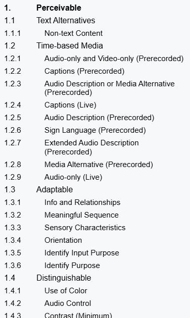
When it comes to actually following them, each standard is a discrete element that can be met or not met. The WC3 has also provided as much guidance as possible to simplify accessible designs without constraining the designs that can be implemented. Structurally, the top level of each criterion written with the assumption that a reader knows enough web design and communication theory to evaluate their own work. From there, linked pages offer more detailed advice, examples, and occasional tools to assess a document’s accessibility.
Guideline breakdown
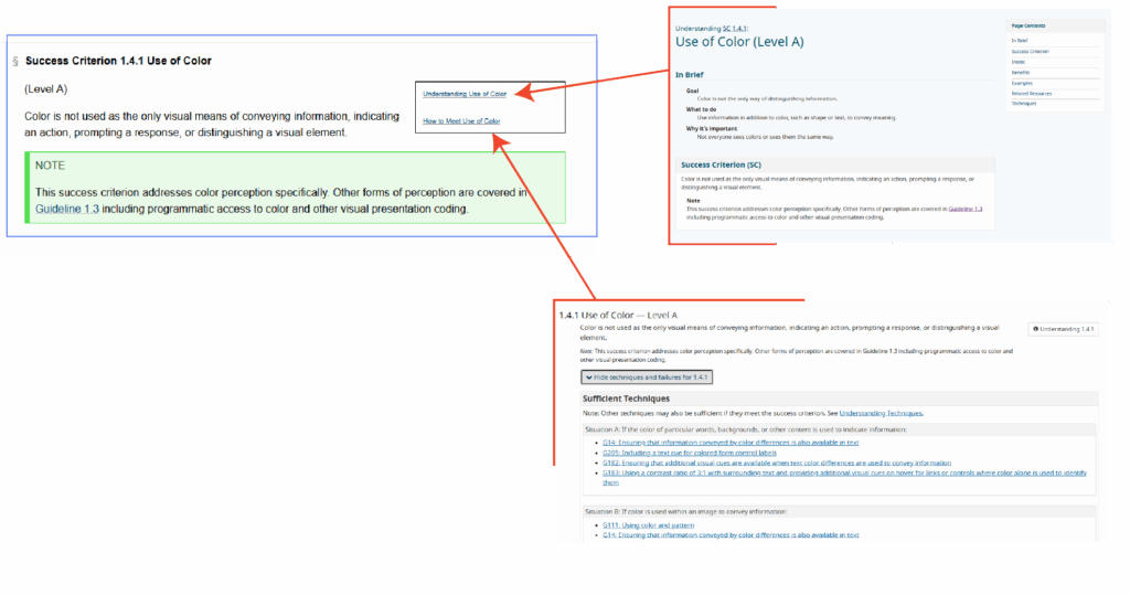
Each standard is described as a success criterion, a simple is or is not statement that ought to describe a webpage, document, video, podcast, email, or other piece of web-based content. They include notes and subpages to help clarify the intent and goal of the criterion.
Success Criterion definition
The definition is meant to be easy to unpack. On use of color, we are told that color is not the only way that a page conveys some type of information. For example, if a webform indicates that some input is wrong (maybe an email address is incomplete or passwords don’t match), we typically highlight the form element in red, but we also need to add some other visual indicator like a ⚠ warning icon or a line of text alerting the user.
Importantly, the criteria are ranked by level. Level A criteria are bare minimum expectations for all content to meet (where applicable). Level AA are the standard expected by the European Accessibility Act, and many users would consider them the norm of web content design. Level AA standards are noticed when they are absent. Level AAA are the highest grade of accessibility. Meeting Level AAA standards may be beyond the technical capability of some content, and it may undermine the creative goals of other content.
Understanding the criterion
An definition page includes a thorough walkthrough, examples, notes on the intent of the criterion, and more. Critically, many criteria include test rules and free tools to evaluate different aspects of web content.
Using the criterion
The implementation page includes technical guides so designers without deep experience in multiple web languages can meet these success criteria. For instance, the Use of Color criterion points users to HTML and CSS code snippets to change webpage component appearance when they receive the “focus” attribute—like when a user with assistive technology scrolls through a page, when a user presses the tab key to move through elements on a page, or when they tap their screen
Do I need to meet them?
While WCAG sees these as guidelines, other governing bodies do see them as rules. The EAA fine structure applies to any organization doing business in an EU member state, and the EAA expects a meeting minimum of Level AA criteria at every possible instance.
Maybe more importantly, these guidelines are just plain good to follow. They make communication easier to consume and understand. They cut out the friction users might experience on a website or when enjoying a video or podcast. As web technical standards continue to evolve, the expectation will always be that people are trying to follow these guidelines—if you’re already trying to meet the guidelines, then the technical standards won’t be something you need to fight against.
How do I know if I’m meeting them?
Unfortunately, there aren’t many easy, one-click solutions. Paid services exist that will audit your website’s CSS and HTML files along with video and audio assets. To some degree, these standards are designed to make it easier for software to consume media, particularly in the case of assistive technologies like screen readers. But, in the end, these guidelines are written with a focus on making your content human consumable.
The best way to know if you’re meeting the guidelines is to stop asking whether you’re trying and start looking at (or listening to) your content from different viewpoints.
What’s a disability?
We often talk about accessibility as an extension of disabilities, but it is a bigger concept than simply meeting the needs of users with different ability levels. That said, it’s important to consider the core group of users that accessibility guidelines are designed to help.
The Typical Definition
Usually, we think of a disability as a missing or impaired ability common to most people. This is very limiting, and it hinders our ability to make good design decisions for al audiences.
For instance, On the web, vision impairment is a common concern. We may be talking about fully or functionally blind individuals accessing the web, or we might be talking about individuals with color blindness or extreme near-sightedness. Similarly, auditory or cognitive impairments cover wide spectra, any part of which can complicate consuming content. None of these specific instances cover some of the most common issues affecting web users.
The Real-World Definition
For many users, accessible designs mean they can get their phone to read emails out loud while they cook breakfast. Accessible designs mean a website will be clear and legible even on a monitor with poor contrast or color definition, or even with the brightness turned all the way down for night reading. Accessible video content has accurate subtitles and a complete, time-tagged transcript, so users can CTRL+F and find a specific piece of information as easily as they could in a text document.
In this sense, a “disability” (when considering our audience for web content) is actually any physical state, environmental context, or technological configuration that could impede someone’s ability to read, listen to, view, or interact with the content we create.
- A noisy environment makes it difficult to hear a video, so the user turns on subtitles
- A busy parent uses a screen reader to listen to emails and team chat channels before work while kids are getting ready
- A customer is browsing several ecommerce sites at once, and they rely on well-thought out layouts and use of semantic tagging to easily compare features and prices
How do I prioritize these guidelines?
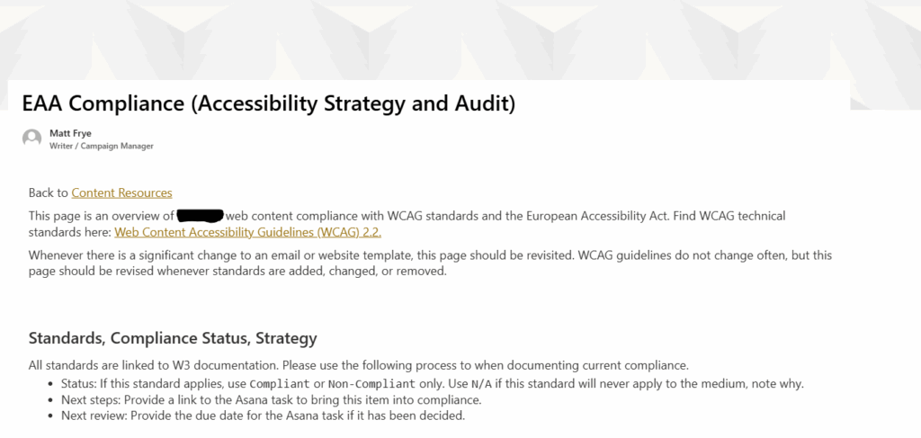
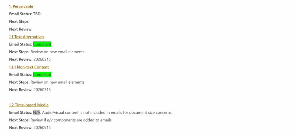
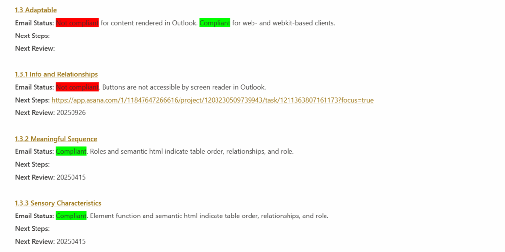
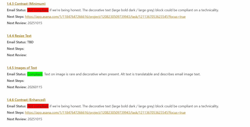
With 100 guidelines to follow, prioritization is key to managing an accessible design. When auditing the design of any media, a simple method of triage can help you reach your goal effectively. The example below shows the results of an audit I performed on a company’s email templates.
Successes
First, work through the list and document every criterion where you are already succeeding or that do not apply. If you’re already following common practices in your content, you likely meet many Level A and AA criteria. More importantly, these guidelines cover all web media, including video and podcast content. If your own content doesn’t include those technologies, you don’t need to worry about them.
Documenting successes will help thin the list to the things you need to address rather than providing and endless supply of things you can always improve on.
Sidelines
Next, honestly document the things that you are not in compliance with and that you don’t intend to be compliant with. Many Level AAA guidelines are difficult to achieve, and they can require significant changes to how you are planning your content in order to release them.
For instance, this page uses several screenshots of English text. If your computer’s or browser’s default language is not English, you might be reading a translated version of it, but your translator cannot read the content of those screenshots. I’d love to make this page more accessible to translators and screen readers, but the best I can do right now is the Level AA standard of providing detailed alternative text. I cannot meet the Level AAA standard of removing text from images entirely.
In some cases, you may be locked into non-compliance due to the technical limitations of your composing tools. Documenting this gives you an easy place to pick up should those technologies ever offer more accessibility features.
Struggles
Finally, the real work begins: document the places where you are out of compliance and where you can improve. After the first two sweeps for Successes and Sidelines, the remaining list is unlikely to be onerous, but each item is something that will need to be addressed individually.
What next?
If you want help with an accessibility audit or need some advice on meeting specific success criteria, let me know. I have a depth of experience finding and creating accessible solutions for web and print, particularly when the communication technology itself seems to impede every effort at improvement.
