Design Opportunity: Critical Hit Cards

Every so often, I get the chance to work with the folks Dirty Vortex, designing or editing game materials. This week, I get to make a set of critical hit cards for some new game lines. These are in the d20 5th Edition ruleset, starting out in a Fantasy theme and possibly expanding to Modern and Science Fiction settings.

This seems like a good opportunity for a portfolio piece and a good chance to talk through my design process.

Expectations

I’m making a set of cards to represent critical hits in tabletop roleplaying games. These products have existed for some time, and they were made especially popular with the series of card products that Paizo Publishing made for their Pathfinder roleplaying game. Generally, these cards are meant to either stand in for a rule book (so players can just keep a small pile of cards representing their skills or abilities in front of them rather than flip through a few hundred pages of rules) or expand some aspect of gameplay. This set does the latter.

[su_spoiler title=”What’s a critical hit?” icon=”arrow-circle-1″]A critical hit is when a character or monster makes an exceptionally good attack roll (typically the greatest number their attack die can roll, like a 20 on a 20-sided die). In game terms, this means the attack will do additional damage, usually double or triple its normal amount. In storytelling terms, this means the attack hit an especially vulnerable or critical area of its target.[/su_spoiler]

I’m creating a deck of 54 cards. As I begin, my contract doesn’t specify whether these will be playing cards as well, but we’re leaving that option open once we see how the cards themselves shape up. The cards may also include coin flip results and other odds and ends to make them extremely versatile at the table.

Each card will have several possible results on it, depending on hit location, attack type, effect or other traits. Plenty of products exist that provide 3-4 different effects depending on the original attack (e.g. describing different effects of a club attack versus a sword attack). We want to do something different, but it’s my job to figure out what different will look like.

My job is text creation and ensuring the material will fit on a standard playing card. However, I put a lot of thought into production medium whenever I’m making something, so my design process will include a little bit of layout to make sure it works.

Early Design Process: Clarifying Boundaries

I asked for and have been given a green light on gore heavy material, so some of the screenshots below are going to be censored. I didn’t ask for juvenile or prurient reasons: there simply are not as many products in the d20 system that cater to an adult audience as there used to be. Heavy Metal was influenced by and strongly influenced tabletop roleplaying games for decades. In the early 2000s, Wizards of the Coast and a few other publishing companies (like AEG) put out some material meant for adult players, but the audience wasn’t large enough to give much traction to the product lines. This is probably one reason D&D has become so popular again with kids and families: the gameplay is a little simpler and the content is more PG.

But, other companies have produced material meant for older audiences. White Wolf, for example, started in the 1990s with its Vampire: the Masquerade line. They saved the truly dark and adult content for their Black Dog imprint, but very little of their game content could be described as “family friendly.” (My daughter regularly picks up my second-edition copy of Changeling: the Dreaming‘s main book to tell me how pretty the pictures are. The joke about that game is that the art has to be lighthearted and beautiful because the game itself, centering on themes of lost childhood and innocence, can be pretty depressing.)

So, as I craft my materials, I’m going to think about products like Human Occupied Landfill from Black Dog, the World of Darkness Combat book from White Wolf and some of the more grotesque things I’ve seen in the Palladium series.

Getting Started

There are several ways to approach card design. Start writing on notecards with a pen. Fire up InDesign, make a playing card template, and get to doing some layout. Play through some dummy combats by myself with some D&D characters, and write down interesting ways to describe critical hits.

Everyone’s going to have a different process. Because I’m making a series of individual documents (individual cards) that use the same template, I’m going to fire up Excel and start making card content. I’ll start with a simple table that I think will represent the cards.

Draft 1: Pieces without a Plan

Draft 1: Not working like I wanted

I made a sheet with 54 rows, differentiated first by attack type, the degree of critical effect (Low being a regular critical hit, Medium being a hit with some additional effect and High being something truly devastating) and spaces for descriptions. As I worked through it, I found that there wasn’t enough structure to really wrangle in my thoughts. A high effect, single-target melee attack to the head might blind or incapacitate the target, but what about a high effect, single-target ranged attack? Wouldn’t that be the same?

A few cards in, I decided to copy the descriptive text into another sheet and take a new approach. This is also around the time I got the gore green light.

Draft 2: Hit First, Damage Second

Draft 2: You know I’m serious because it’s a structured table

I remembered the hit location rules from Cyberpunk 2020. First, roll to hit. Second, determine hit location. Third, determine damage. So, I decided to lead off this table with hit locations and a magnitude note. I simplified the attack types to range, melee or social for now. I also added some calculation columns to make sure I wasn’t writing too much. I’m assuming 70-100 words per card total, so my text blocks need to stay around 25-30 words if I’m doing three per card or 20-25 if I’m doing four per card.

I’m still running into the repetition problem here. To take the same example above: a high effect hit to the noggin isn’t necessarily going to be different if the attack was a sword or an arrow, but it might look different if it was a club or a thrown hammer.

Hmm. Ideas…

Draft 3: Nature of Trauma, Location, Effect

Draft 3: How often do I get to use “energaic”? Not often enough!

Alright, let’s get medieval on this problem. I’m talking specifically about the old Wounded Man medical texts from the middle ages. A head wound isn’t just a head wound, and a laceration isn’t just a laceration. A laceration to the head? Now we’ve got something we can treat!

Now, five attack types is going to be a challenge. If all five go onto a card with 70-100 words, then I’m looking at 15-20 words per description. A creative name for a critical effect might have 3-4 words, and I’ve got to have a narrative description and a mechanical effect. (No, those aren’t in the contract, but they aren’t not in the contract either. I’m making game components I’d actually buy.)

But, this problem feels easier to solve. Each card already affects a single location. I could probably consolidate some of these other fields to get more space for creativity.

Draft 4: Efficiency of Space

Draft 4: The Final Frontier

Creativity took the form of making the hit location and its effect the main features of the card. The damage type (a sword, a club, a fireball, etc.) was changed to flavor text rather than mechanical effect—after all, if the point of a critical hit card is to say “you bonk your opponent on the noggin, so they’re stunned,” it really shouldn’t matter whether the bonk was a lightning bolt, an arrow or a club. Since my task was designing the text and the general mechanics of the cards, I left the iconography up to my client, but I advised him that I was generally thinking of something like the graphic below (his work).

It doesn’t quite follow along with all of my planning processes along the way, but the ultimate constraint of words per card is what led to the consolidation here. I would love to do a more detailed “wounded man” set of cards, but experimentation here leads me to believe I would have to create a separate deck for each type of wound. That would be fun, though.

In talking about it with the client, that option seemed a little more plausible for other game settings. In a sci-fi game, for instance, it would be a little more reasonable to make an entire deck of crit cards for laser and blaster attacks.

Final Draft

Design Mock-up by Mark Kelly at DirtyVortex.net. Not a final product.

The final spreadsheet was delivered. Following some other design notes we’ve been tossing around, the cards double as a set of playing cards (note the 5♣ in the top corner) and triple as coins (note the ➕ in the other top corner). We’re still trying approaches to make a 54 card deck work as a set of D&D dice, but I think that’s a larger math problem than I should be solving at 5 cents a word.

Ultimately, the cards do the thing they were supposed to:

  • Critical hit name and effect (top and bottom of card)
  • Multiple functions per card (playing cards, coins)
  • Add description to something that can become a simple math problem in D&D games
  • Speed up gameplay by giving quick numbers to a critical hit rather than asking people to roll several more times

The project has also opened up a few other design doors, specifically in thinking about narrower combat types, as well as options for things other than combat.

Update to be posted when the product is live!

How–and why–I use OBS for student feedback

I’m a big, big fan of the Open Broadcast System (https://www.obsproject.com). It’s open source and incredibly versatile as a screen recording tool. The YouTube video above walks through the rationale I have for using it instead of the Canvas video recorder. It has the affordances of most screen recording software, but it adds a few extra features that make it especially useful as a student feedback tool.

Easy Layout

The layout is pretty straightforward and easy to learn, especially if you’re just learning it.

#1: The video

Simple enough, the main thing you are looking at when OBS is running is the video you’re making. This makes it easy to monitor and make sure everything you think is being recorded is actually being recorded. When I tried recording instructions or walkthroughs in other software, I didn’t realize that context menus (the things that pop-up when you right click or open a menu, like the QuickStyles menu in Word) and dialog boxes (smaller windows where you set options for programs, like the font settings window in Word) weren’t captured. I’d get confused emails from students, wondering what I was talking about with the Word Reference Manager, since they couldn’t see a single thing I was doing.

If you’ve got multiple monitors, it’s great to leave OBS running on the screen you aren’t recording, since you can keep track of the video a little more easily.

#2: Scene setup

“Scenes” are the saved settings for any particular video type you might record. You can see I’ve got a basic “Scene,” two virtual cameras (more on that below), and an “Assignment Feedback” scene, which is currently active in the screenshot. This is useful if you record different types of videos.

When I record feedback for students, I use “Assignment Feedback,” which already has a bunch of Sources (see below) dialed in. When I do a general recording of myself for a weekly announcement, I use “Scene.” And, if I want to do anything special with a Zoom call (like put my name and job title on the slide or share something on my screen without the Screen Share tool), I can use one of the virtual cameras.

Super useful because I don’t have to set this stuff up every time I launch OBS.

#3: Sources

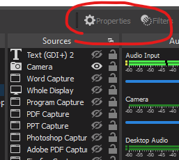
This took me the longest time to figure out. Obviously, the ➕/➖ in the bottom adds or deletes video and audio inputs. The up and down arrows move things in the “stack” of sources, so placing “Camera” above other sources makes sure it stays on top of any other window or video I want to share.

zoomed in screenshot of properties and options buttons in OBS

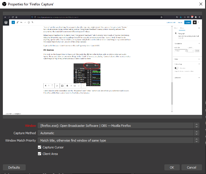
I didn’t label it in the screenshot, but the “Properties” and “Filters” buttons are also where you customize each source. This offers a little finer control over the final video. For instance, my Firefox Capture source (a generic “Window Capture” source in OBS) has the following properties:

source properties panel in OBS

The top panel shows a preview of the video source, while the dropdown menus help fine tune what’s selected. The Window menu selects what window it should be looking for. Importantly, the “Window Match Priority” menu is what makes the Source a little easier: mine is set to find the same title (“Open Broadcaster Software…”). If it can’t, it should look for the same type of window (“Mozilla Firefox”). When I’m giving student feedback, if I don’t want to share my entire screen (which might include other students’ grades, my Facebook feed or other stuff I don’t want to share) and I don’t want to select which window I want to record for each video, this automatic source selection is really useful.

Maybe more importantly, when I’m giving student feedback, I am usually working through a lot of windows. I’ve got their submission open in Canvas (a Firefox window) for the rubric. I’ve got their submission open as a Word document, a Premiere video, a Photoshop document or whatever else. I might have a PowerPoint open from class. It’s far easier to toggle the visibility (eyeball icon in the Sources panel) of each window than try to track each one down as I go.

#4: Audio Mixer

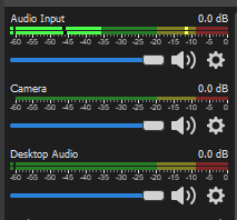
After I figured out how to start a recording (below), this was the second tool I really figured out how to work. Every Source that has audio is listed here, along with your “Desktop Audio”—the sound coming from whatever applications you have open.

zoomed in view of the audio panel in OBS
Mute mute mute mute mute mute mute!

We’ve all had it happen in video conferencing and similar tools: we think we’ve muted ourselves or that we’ve muted the things we don’t want to interfere with us, but we didn’t. Or, we ask people repeatedly, “Can you hear me OK?”

The audio mixer gives two important tools for screen recording, especially in student feedback videos. First, any of those speaker icons can be clicked to mute that source of sound. Really useful if you’re clicking through websites that might have ads with sound!

Second, the mixer tells you how loud various inputs are: the red is too loud, with the audio likely blowing out any words you’re saying; the yellow is about right and I usually set that as my goal volume; the green is quiet, with noise under -25db becoming hard to hear.

Like me, you might have a non-ideal recording environment. (My personal setup involves an air conditioner right behind me, a toddler typically within 8 feet of me, and dogs barking through the window out our cats.) That gear icon opens up the properties and filters panel for that specific input.

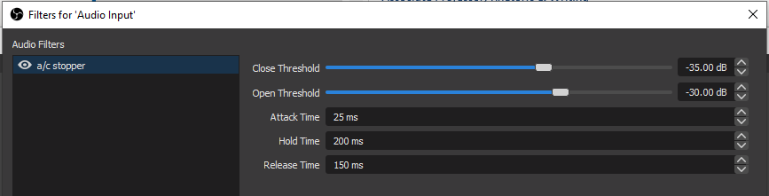
noise gate filter for OBS audio input
Noise Gate

The air conditioner is probably the most noticeable bit of background noise that I have to deal with. It’s a low enough hum that it constantly sounds like I’m in a light windstorm. I don’t want to shout at my microphone to try to drown it out, so I use a “Noise Gate” filter. (You can get the same effect with Noise Supression or a Condenser, but the Noise Gate has the fewest settings to get right.) You can see I’ve got the “Open Threshold” set to -30db, which is just a little quieter than my normal speaking voice when I’m watching those audio levels. So, once my mic picks up a sound louder than -30db, it turns on. It stays on until the noise it’s picking up goes below -35db (the “Close Threshold”).

Scenes!

Remember when I said that Scenes save all of their Source settings? Well, I teach a lot of software classes, which means there is a lot of video time that I spend typing or clicking, which isn’t a great noise to try to talk over at the same time. The air conditioner Noise Gate is useful when I am just recording myself talking, but my announcement video Scene has a few extra filters set up to block keyboard taps and other noises.

#5: Record!

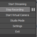
That last panel has the things you need most to get started.

zoomed in screenshot of OBS control panel

The start/stop recording button does exactly what it says: it records or quits recording (hit that pause button to sneeze). The Virtual Camera is something I’ll do a separate post on: it lets you use whatever is in your OBS recording space (#1) as your camera input for things like Zoom. Very useful if you want to show something on your screen without taking over the Screen Share utility! The Settings menu has all of the really useful nuts and bolts, some of which you’ll want to adjust before you start using the program.

Where am I saving these videos?

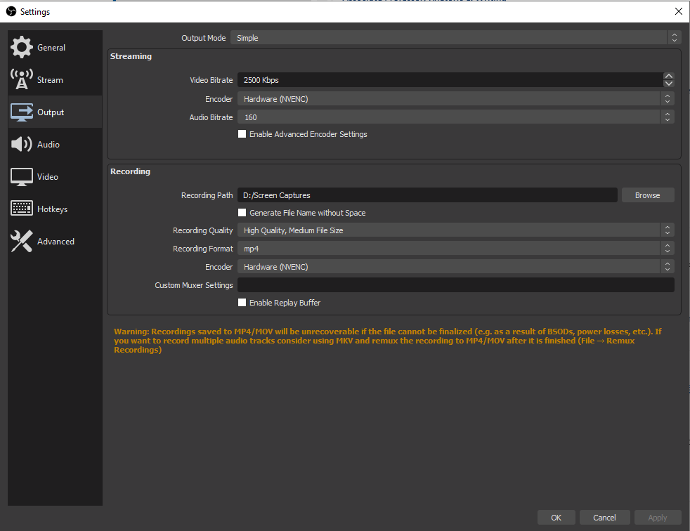
Head to Output on the Settings menu.

output settings in OBS

The “Recording Path” is where everything gets saved, and the Recording Format is the file type. (Important, since YouTube and other tools won’t accept mkv files, and other programs won’t accept mov.) If you are worried about file size, reducing your Recording Quality will reduce the video file size.

Too much clicking! Buttons are tiny!

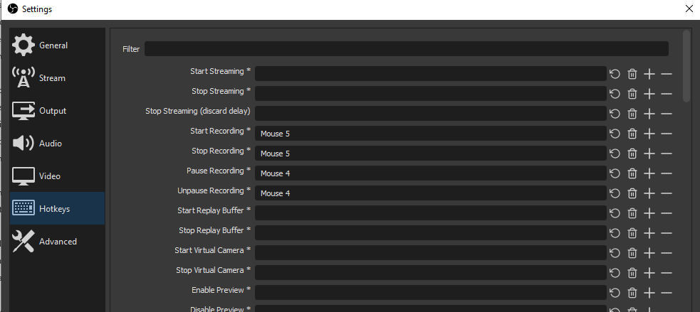
I don’t like the awkward moments where I tell students that I’m looking for the “Stop Recording” button, and if I’ve got to sneeze, hunting down that pause⏸icon is frustrating. The Hotkeys menu will let you set up keyboard and mouse commands to simplify the process.

zoomed in screenshot of OBS hotkeys window

My mouse has a few extra buttons on it, so I can make one of the buttons a start/stop recording button (Mouse 5) and the other (Mouse 4) a pause/unpause button by clicking in that empty line and pressing whatever button or button combination I want to use. (My office computer doesn’t have a fancy mouse, so I’ve set the start/stop record to Ctrl + `.)

Trade Offs?

The setup process takes a while if you do it all in one sitting. But, if you just want to record yourself talking over a window or your whole screen—say, if you’re reviewing a student’s X-ray image they submitted on Canvas and you want to call attention to specific details—OBS is easy to get up and moving. Just set the output destination, add your screen (camera optional) as a source and hit record! All of the extra details here are things I added over time as I felt the need for them.

Writing Teacher Evaluation

Honestly, the thing that makes me use this system for student feedback over anything else is the time. For short written assignments (1-2 page memos), I will give each student 3-5 minutes of feedback. For longer assignments (10 page reports, videos, presentations), I might give 10-15 minutes or more of feedback. That sounds like a lot, especially if I’ve got 40 or so students turning things in.

But, writing and speech teachers know one conversion that helps put this in perspective. The average person reading at a normal talking speed can read a single, double-spaced page of text in about two minutes. So, a three minute feedback video for a short assignment is kind of like me giving back a page and a half of notes. A fifteen minute feedback video is like eight pages of notes.

I can give a lot of feedback in that amount of time or paper. Importantly, it would take far more time to write out the feedback I give verbally, and I’d be missing the visual aspect of highlighting or clicking on things as I went. In all reality, I started doing video feedback shortly after our youngest was born because I did not have the time to do written feedback, especially because she spent most of her life sleeping on my arm or shoulder. Now that she is older and entertaining herself (mostly), I still do video feedback with OBS because I can get feedback to a lot of students in less time than if I wrote it out.

⭐⭐⭐⭐⭐, would download again!

css.php